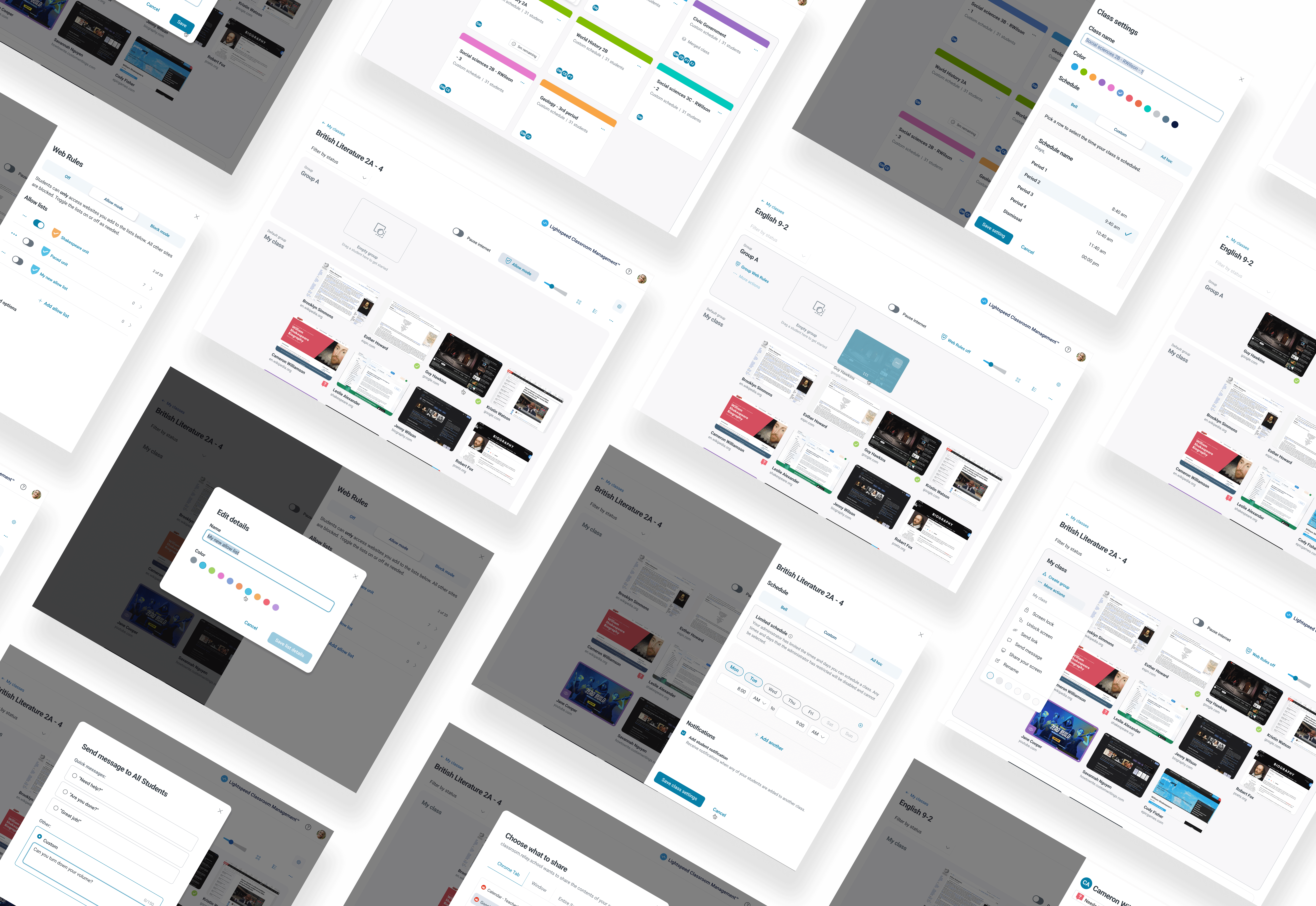
Lightspeed Classroom redesign: a strategic shift to an extensible solution
Aligning product design with business objectives to transform Classroom Management for 80,000 K-12 educators.
App
Classroom Management
Feature
App redesign
Role
Lead Product Designer
Year
2023
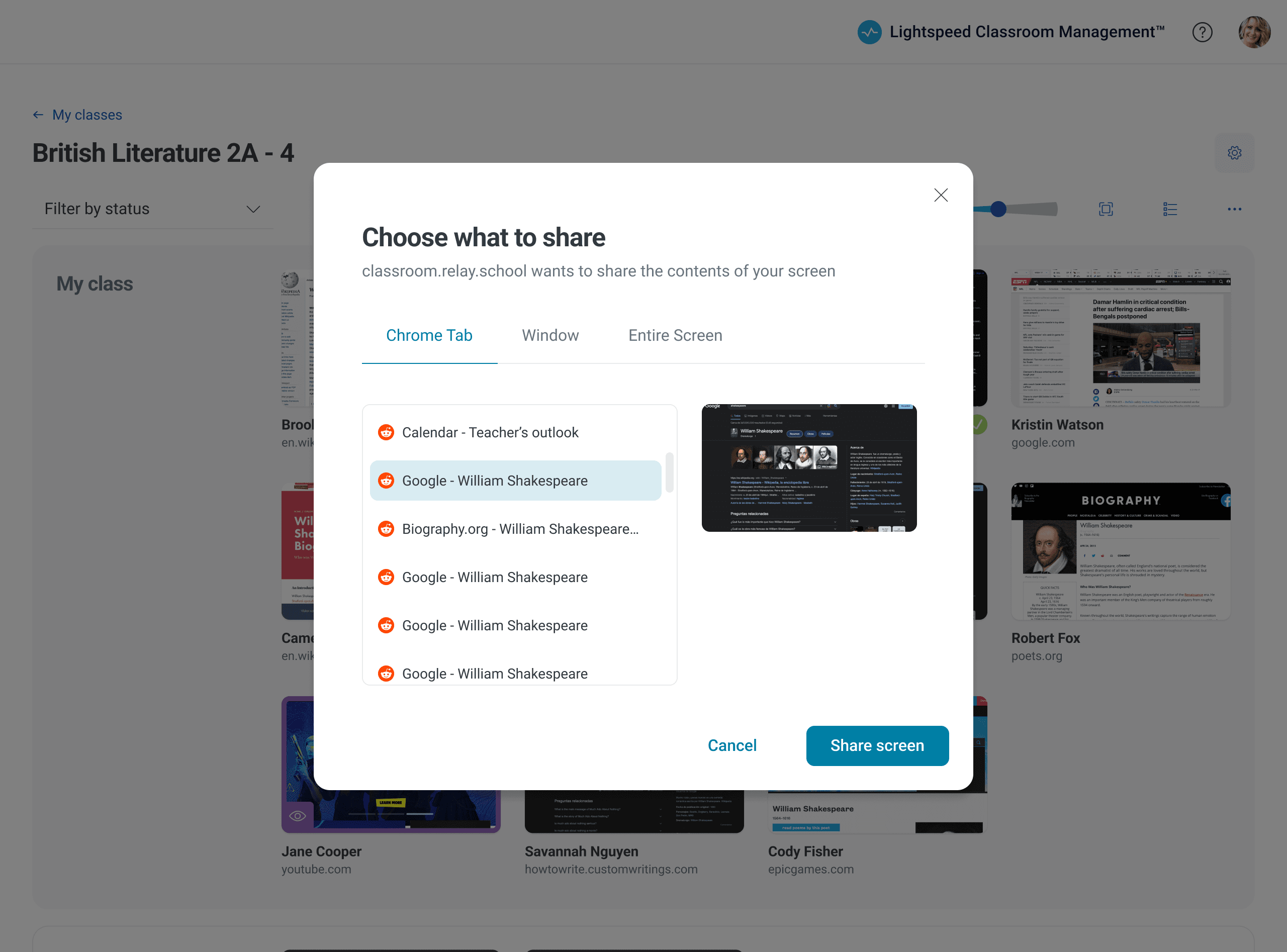
Lightspeed Classroom Management is a web application used during class time by approximately 80,000 K-12 teachers monthly. Its primary function is to keep students on task by monitoring student browsing in real-time, recording their browsing history, and allowing teachers to take corrective actions such as closing tabs, pausing the internet, or locking student screens. Additionally, the app supports instruction by sharing links, screens, and messages and limiting or blocking access to specific sites.
District IT admins are the buyers of this product, and the K-12 teachers are the primary users. The value proposition of Lightspeed Classroom Management was identified in the need for a tool that would keep students focused and on task during their classroom sessions.
Restricted Content
This case study is password-protected to respect my employer’s intellectual property.
Enter passcode to continue.
The approach and scope for the redesign
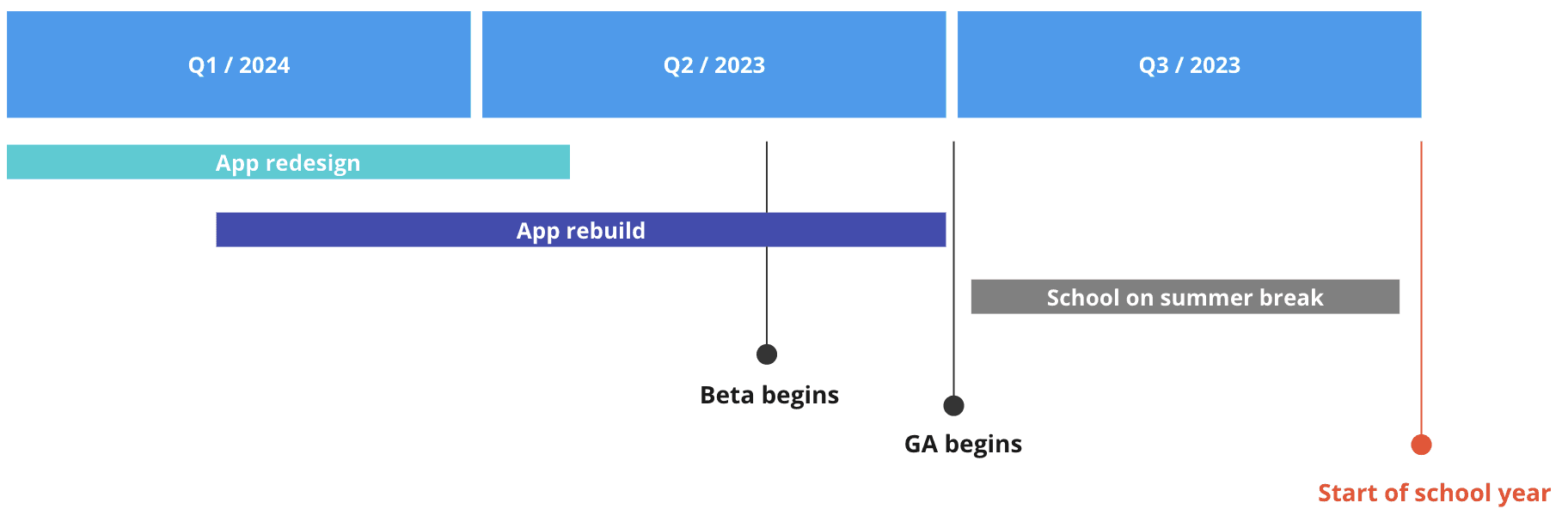
Redesigning a fully-featured app is a huge task, especially with a tight timeframe. In our case, we had to ensure teachers had enough time to switch from the old app version to the new one before the summer break. This meant we only had about five months to design and build the new app.
To accommodate these time constraints, we had to limit the scope of the redesign to lift and shift functionality where possible and maintain current workflows. This approach also added the benefit of reducing time spent on research and discovery, validation, and user testing. It ensured that while the app would look different, workflows and functionality would remain familiar to our users.
Maintain
Functionality
Essential workflows
Update
Visual design
Poor UX patterns
Leverage
Design systems
Existing research
Although the project had a rigid and somewhat narrow scope, I gave myself a good amount of leeway to enhance the app's structural framework and visual design. To meet the business goals, it was crucial to arrange the content and user interface in a meaningful way that catered to the users' needs.
Aligning with mental models and expectations
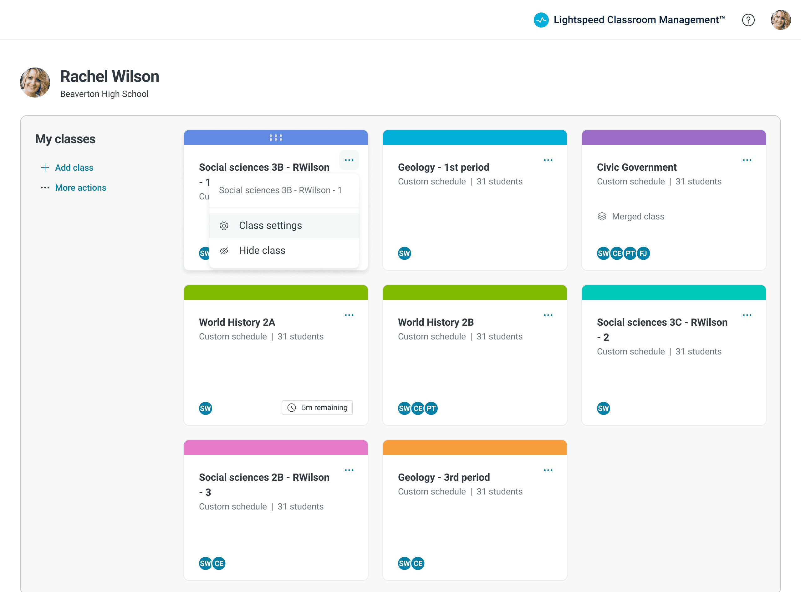
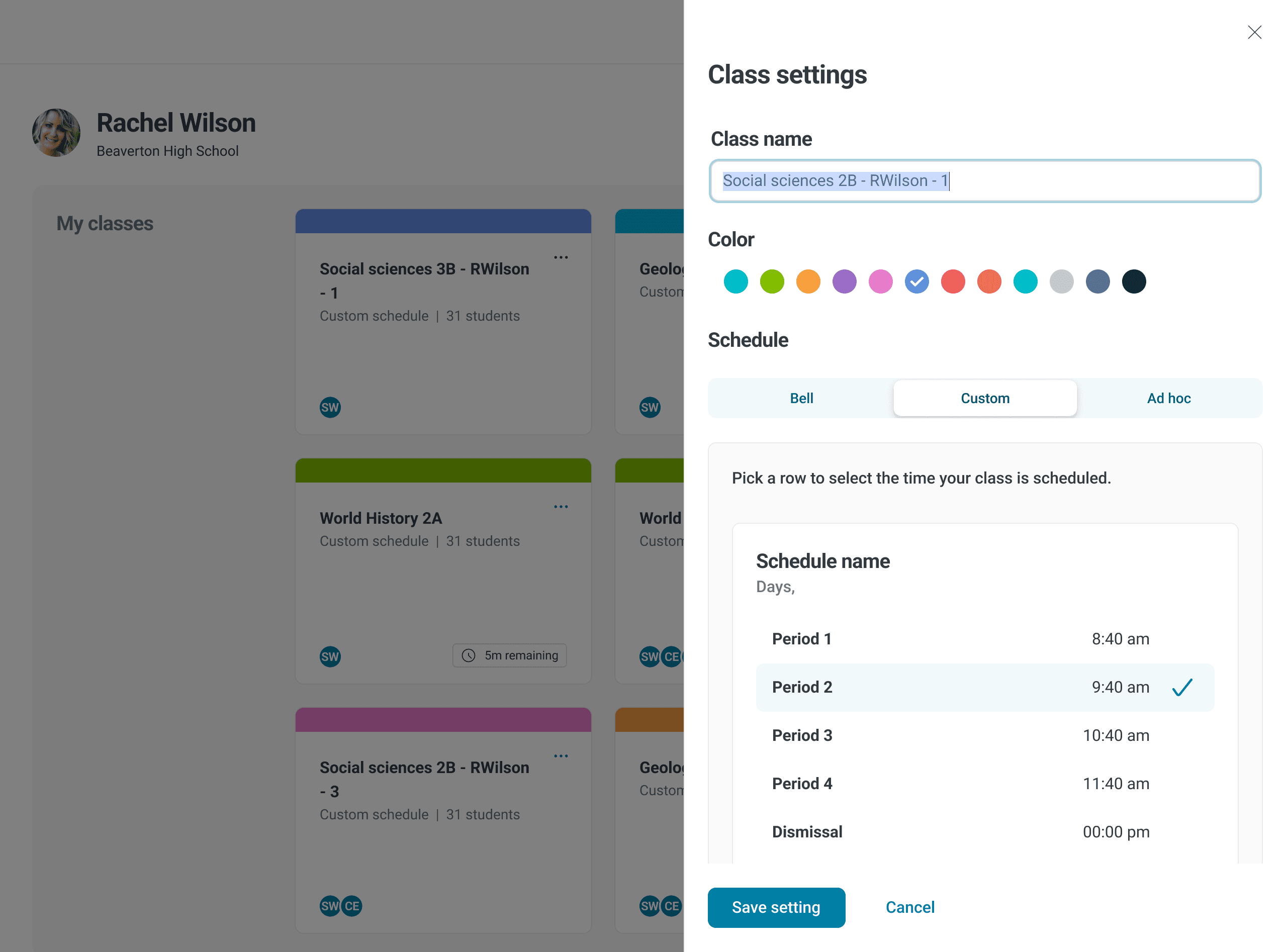
A specific aspect that demanded my focus was the organizational framework (or absence of it) supporting the UX. Throughout K-12 education, a prevalent and well-established pattern of District / Schools / Teachers / Classes / Students exists. This hierarchical model is so deeply embedded in K-12 education that we were failing to fulfill our users' expectations regarding how an EdTech app should function by not designing our app around this structure. For example, in the previous app, a user logged in and was instantly taken to the most recent class they had viewed. There was no product navigation or list view showing all a teacher's classes. Conversely, in the new app, users are welcomed with a list of their classes upon logging in. From this point, they can modify class settings for various classes or select any class session they prefer. Likewise, a district-level administrator can navigate down from the school to teacher to class levels to access a specific class.
Redesigned flow
Navigating a teacher's classes
Original flow
Misalignment with expectations
While this flow may work, it is not something a teacher would expect and only contributes to the app's overall confusion.
Sees
Login screen
Does
Logs in
Sees
Class A dashboard
Does
Clicks dropdown
Sees
List of classes
Does
Selects Class B
Sees
Class B dashboard
Does
Selects settings
Redesigned flow
Conforms to expectations
The new design follows a standard K-12 hierarchy and mental model often used for apps.
Sees
Login screen
Does
Logs in
Sees
List of classes
Does
Selects Class B
Sees
Class B dashboard
Does
Selects settings
Using data to Prioritizing Visual Hierarchy
Our Pendo analytics validated a hypothesis I held; teachers had not widely adopted many of the features we had added in recent years. Anecdotaly, I was recieving feedback that the app had gone from being simple to complicated as more features were progressively tacked on without considering implecations for the holistic app experience.
As I examined the data, a pattern emerged. Monitoring and management features were the most widely used. These I prioritized by placing them within view of the primary surface. The remaining, infrequently used features, I organized within "More actions" drop downs to declutter the interface and give priority to what mattered most to teachers.
feature positioning based on utilization
Monitoring and management features, being the most utilized, received prime positioning in the revamped design.
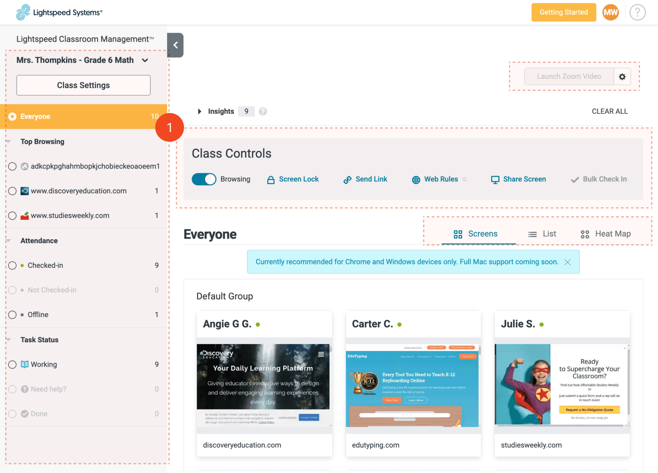
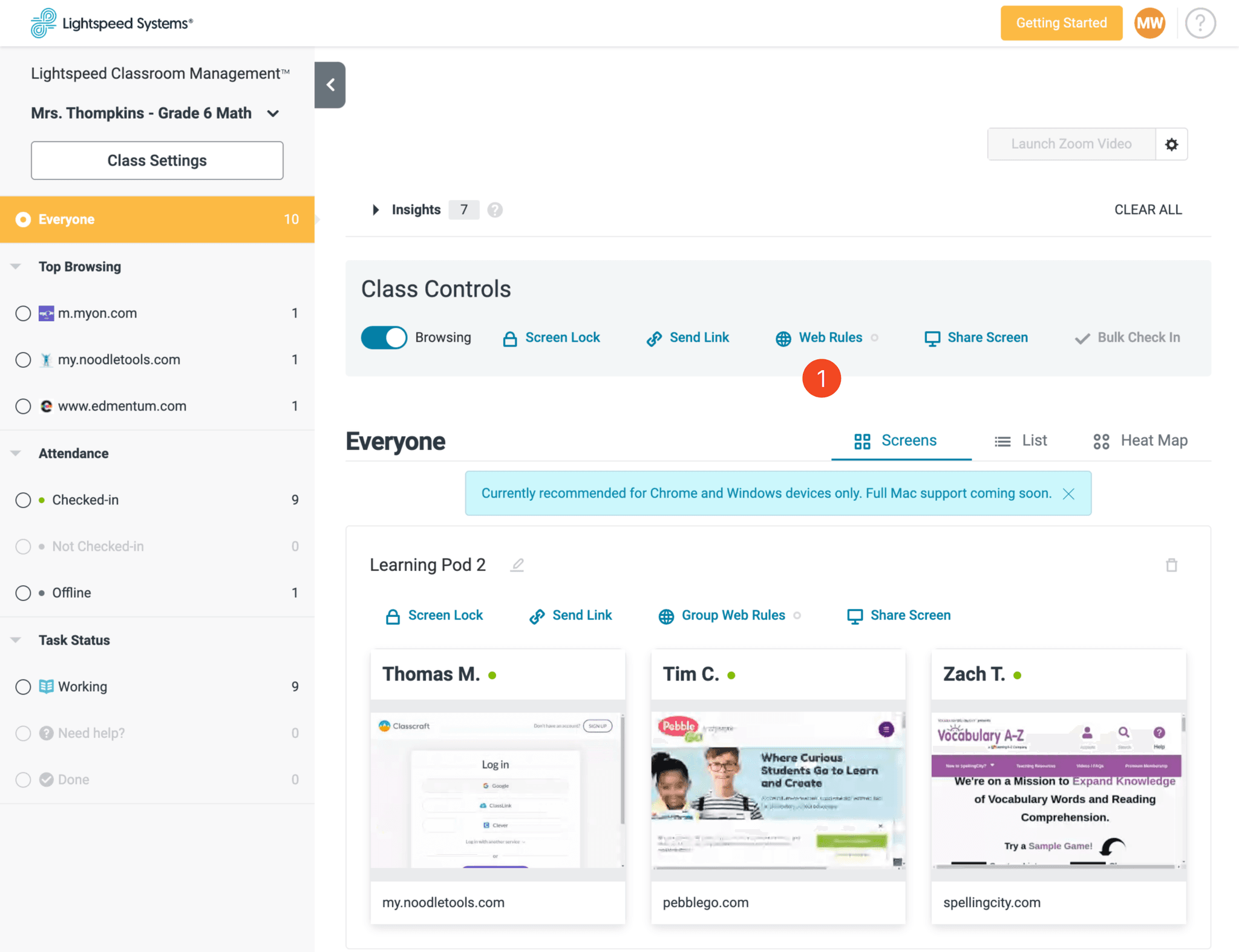
Old app design
Despite being rarely used, all controls are still spread out across the surface.
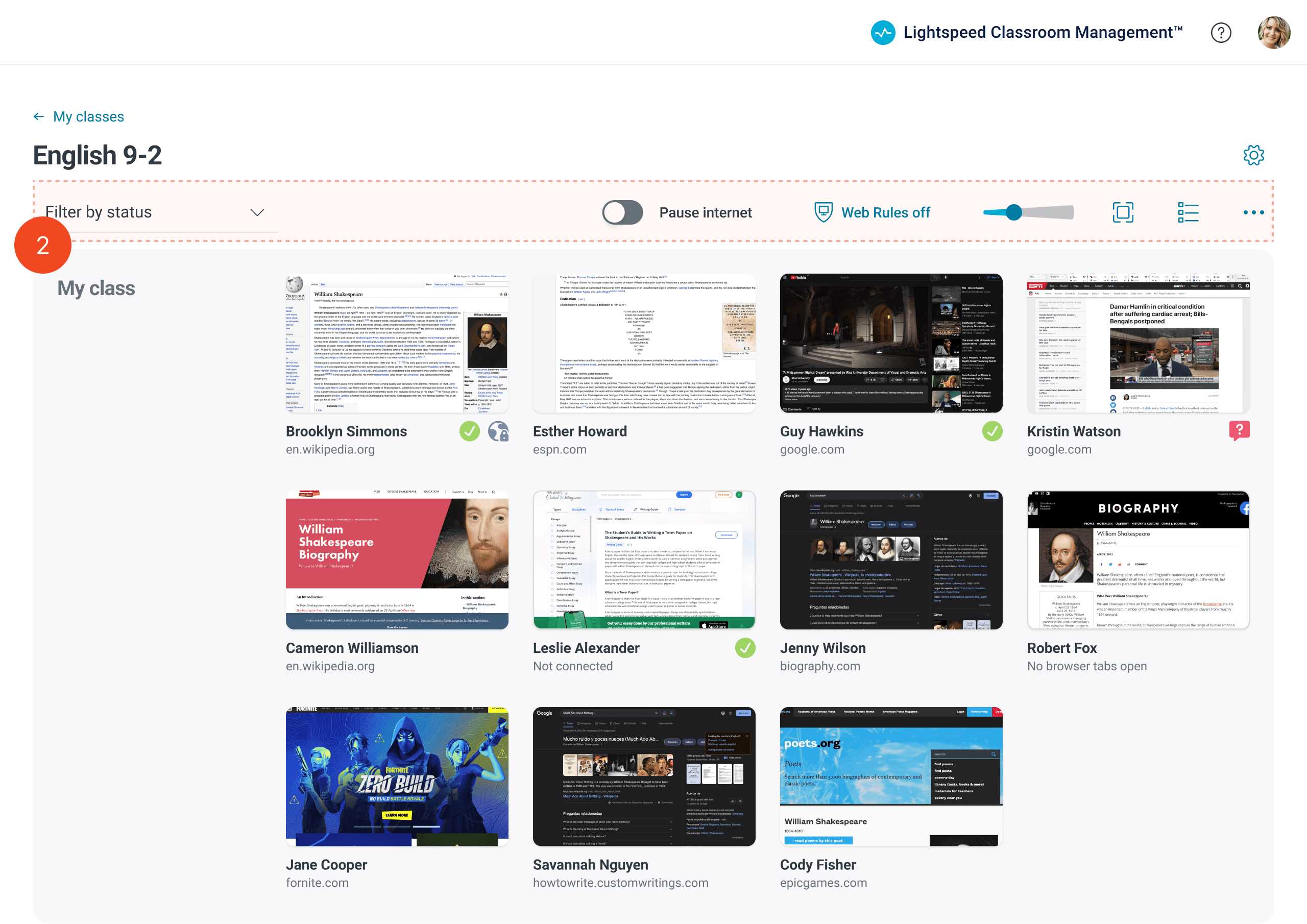
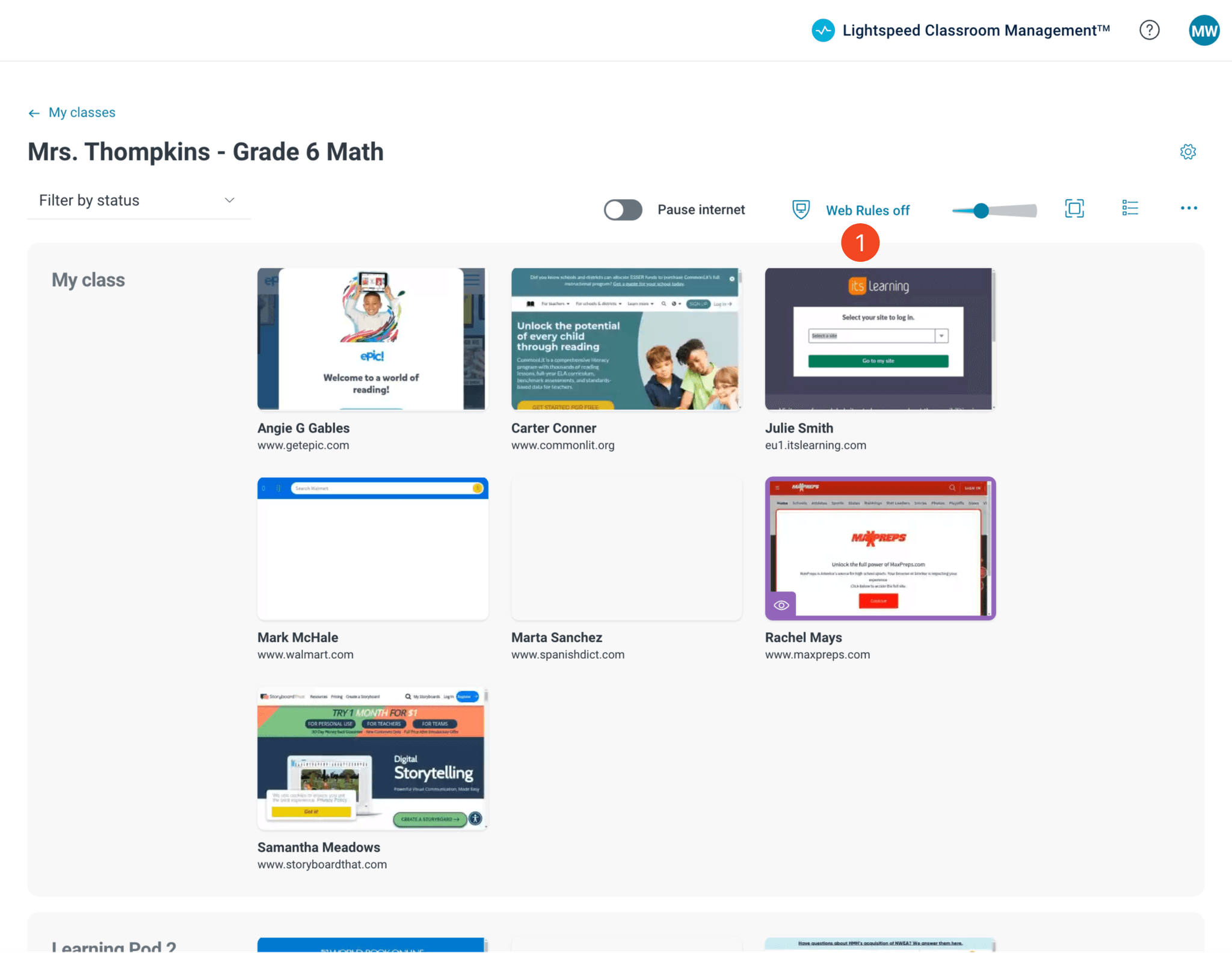
New app design
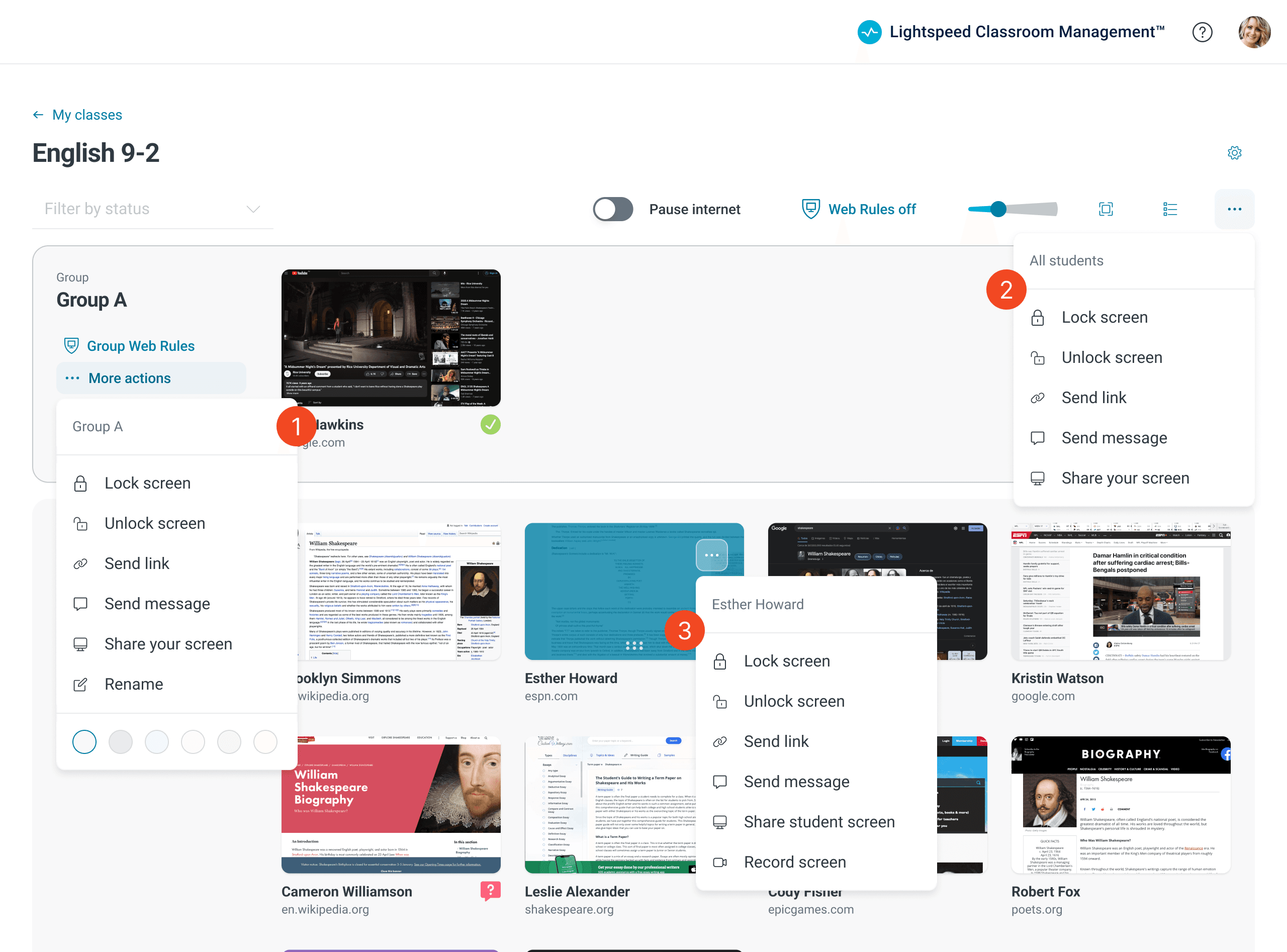
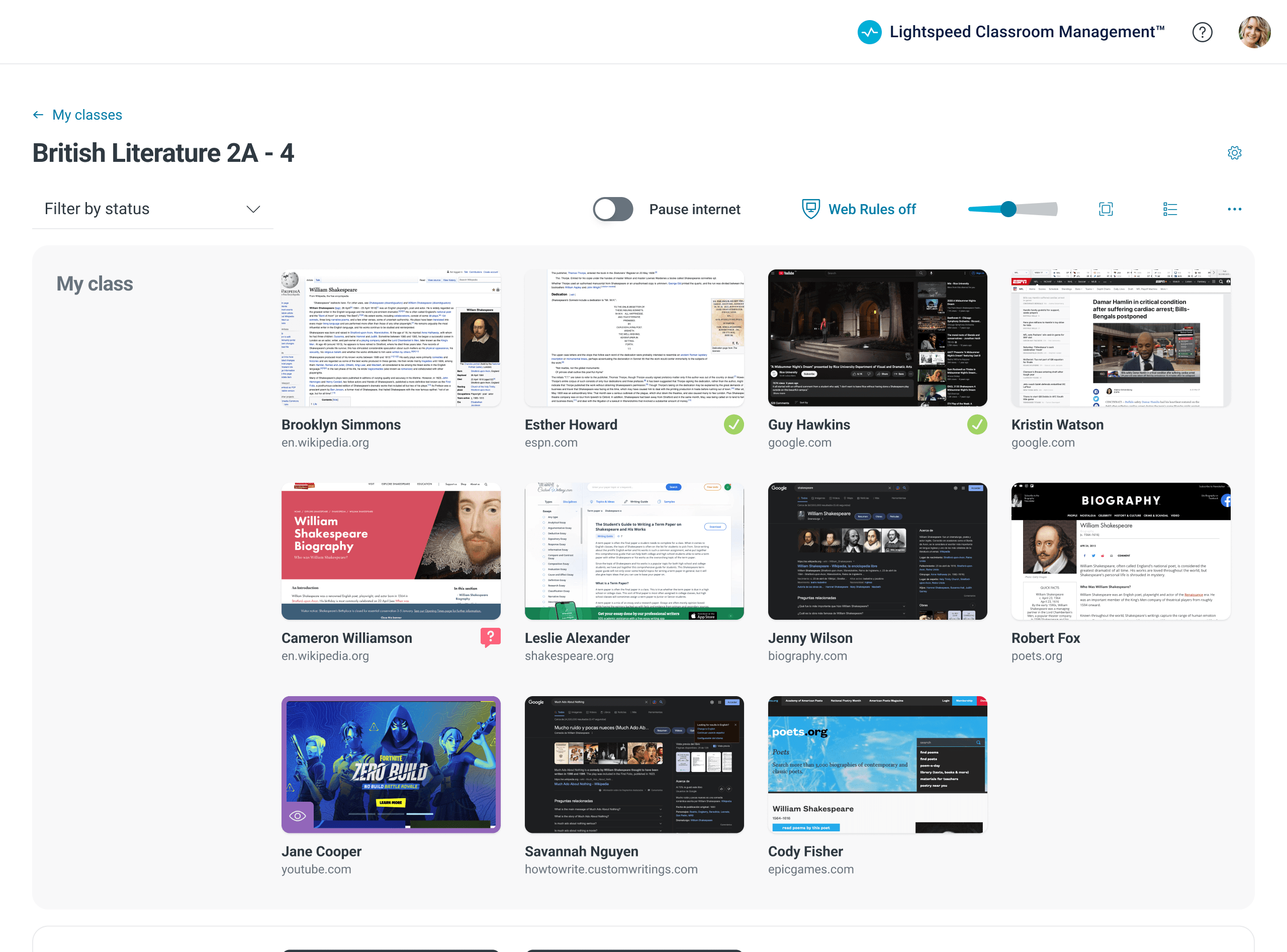
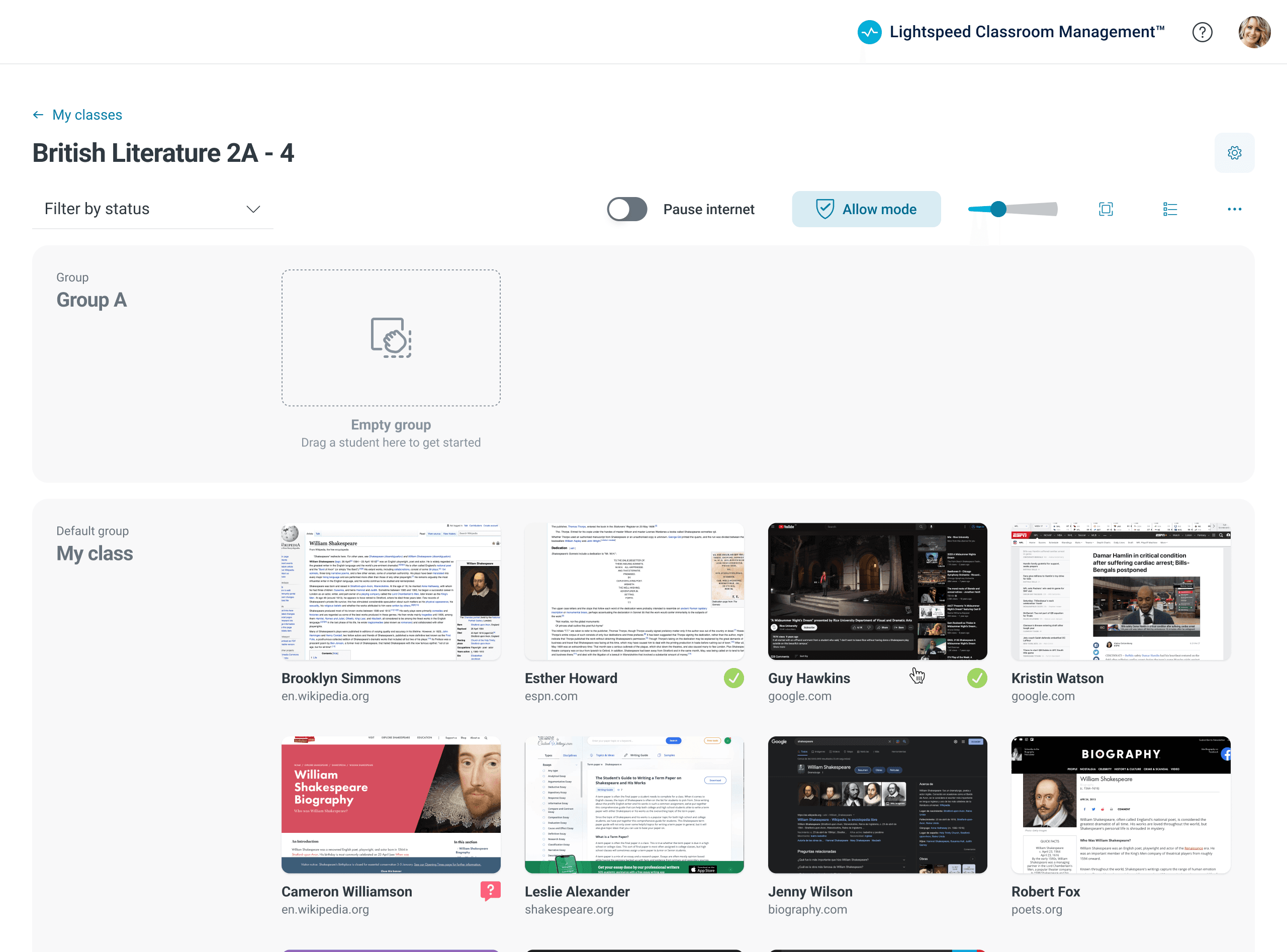
The most frequently utilized controls are arranged in a control bar; the remaining ones can be readily accessed when required.
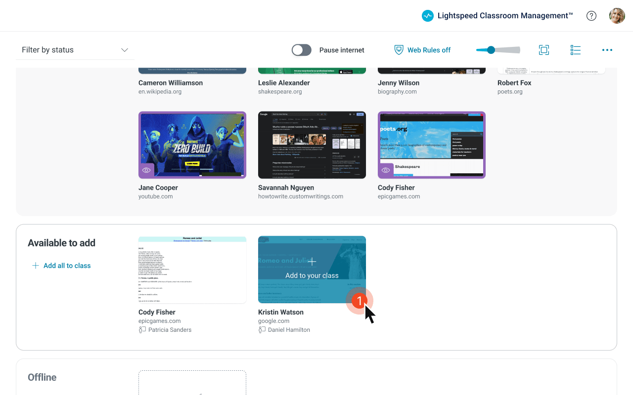
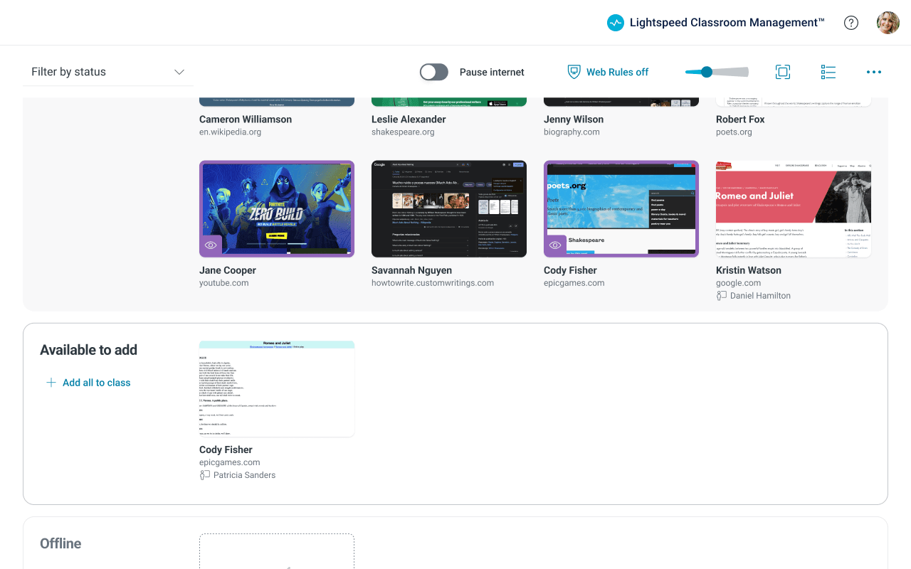
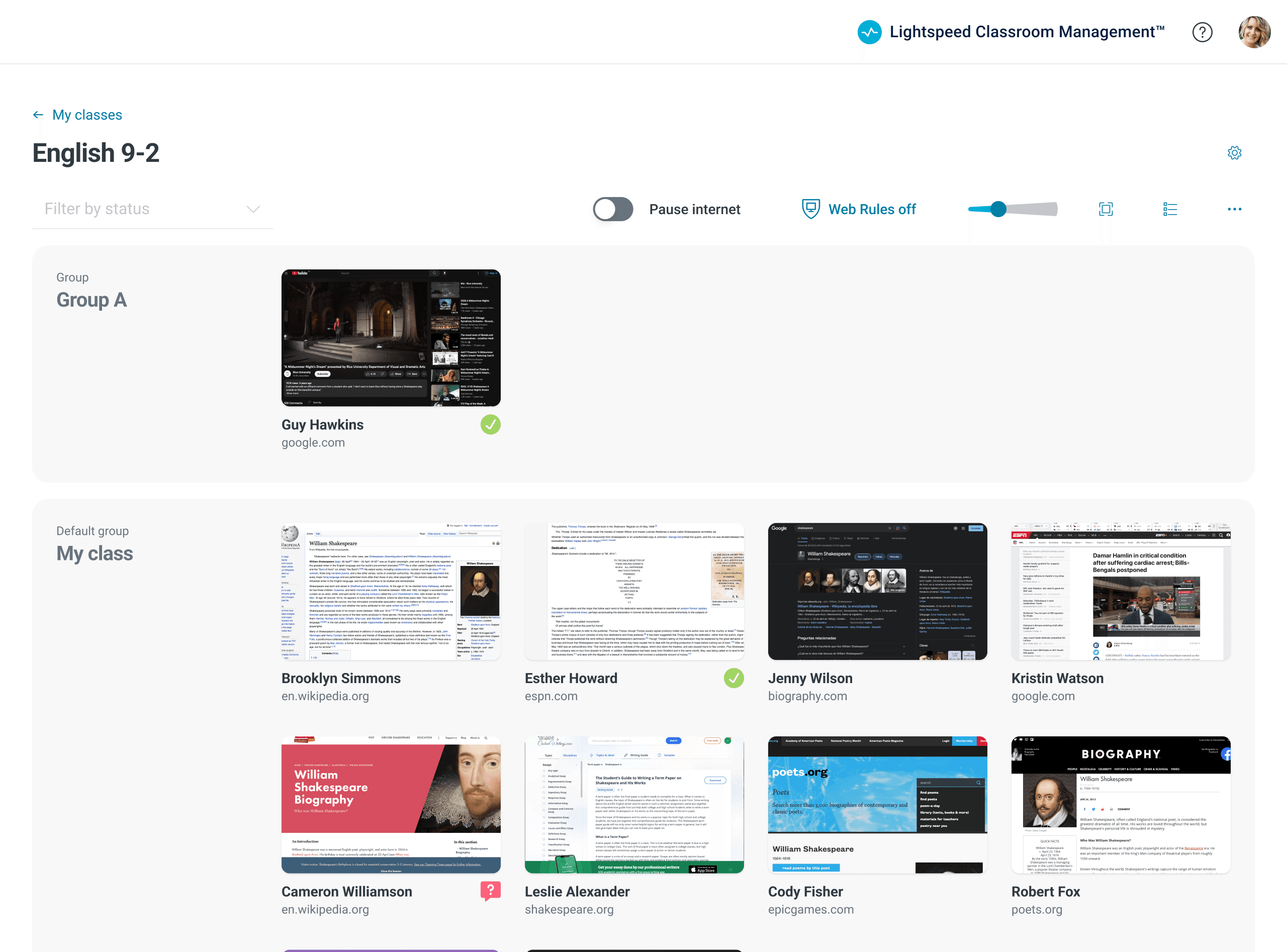
In addition, both my quantitative and qualitative research clearly indicated that a teachers biggest need was to view students' screens. Sometimes they wanted to zoom in on a single student's screen, while at other times, they desired an overview of all student screens. To address this, I aimed to minimize UI clutter and introduced dynamic screen-size scaling and a focus mode.
Improved real-time monitoring
Teachers can now zoom in and out for a complete perspective of student classroom browsing.
Consolidating UI and Unifying Patterns
Without a guiding vision or 'north star', features had been progressively tacked onto Lightspeed Classroom Management in a rather haphazard manner, resulting in features that seemed randomly structured. This negatively impacted both the learnability and discoverability of the features.
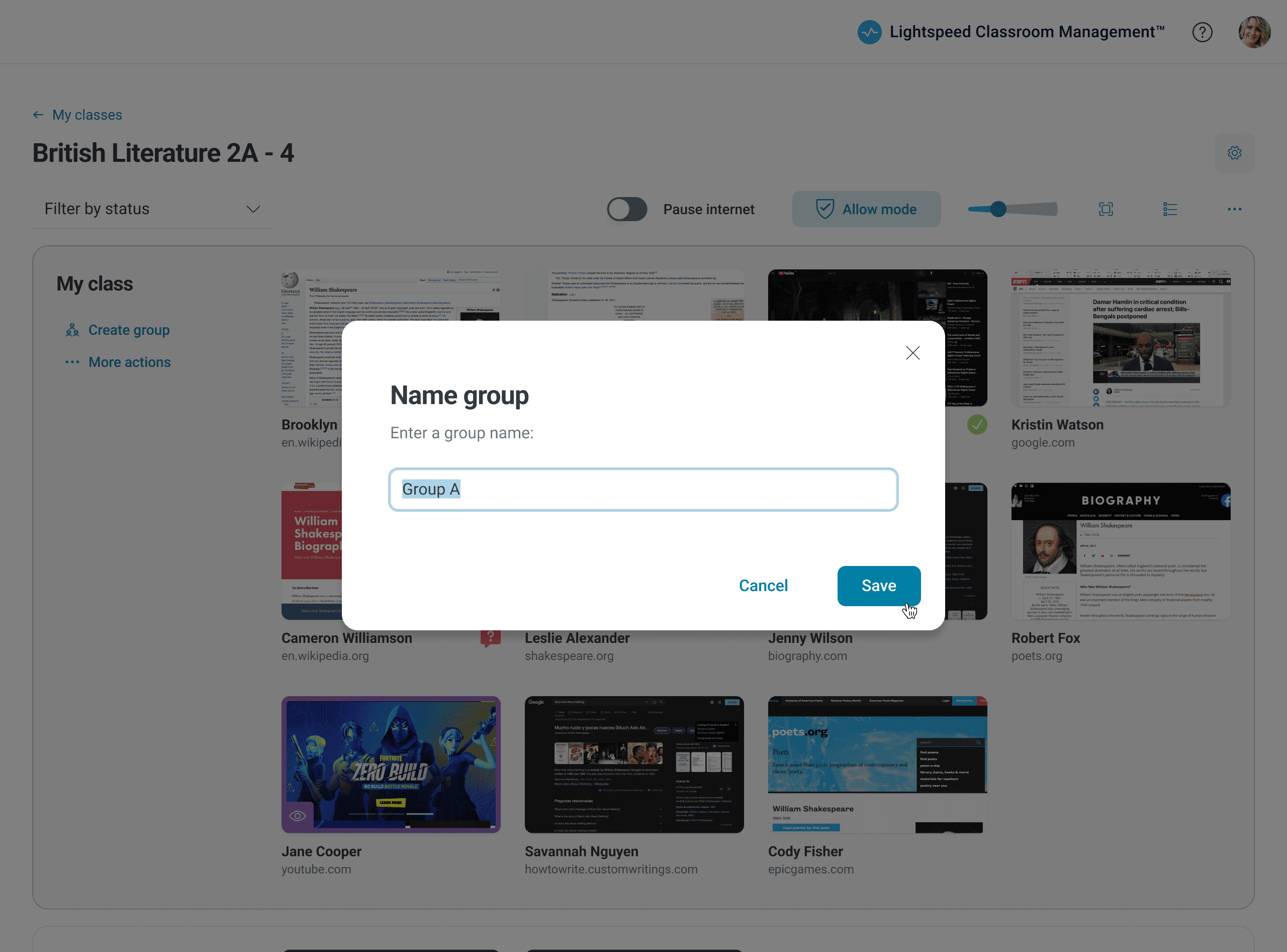
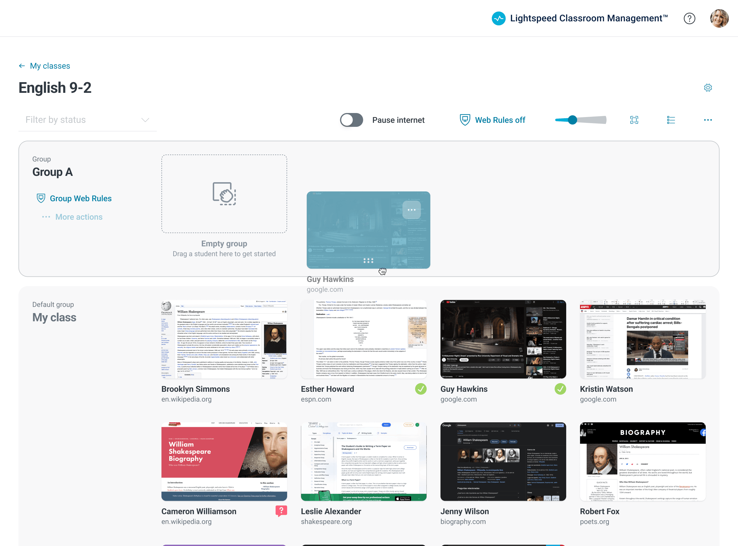
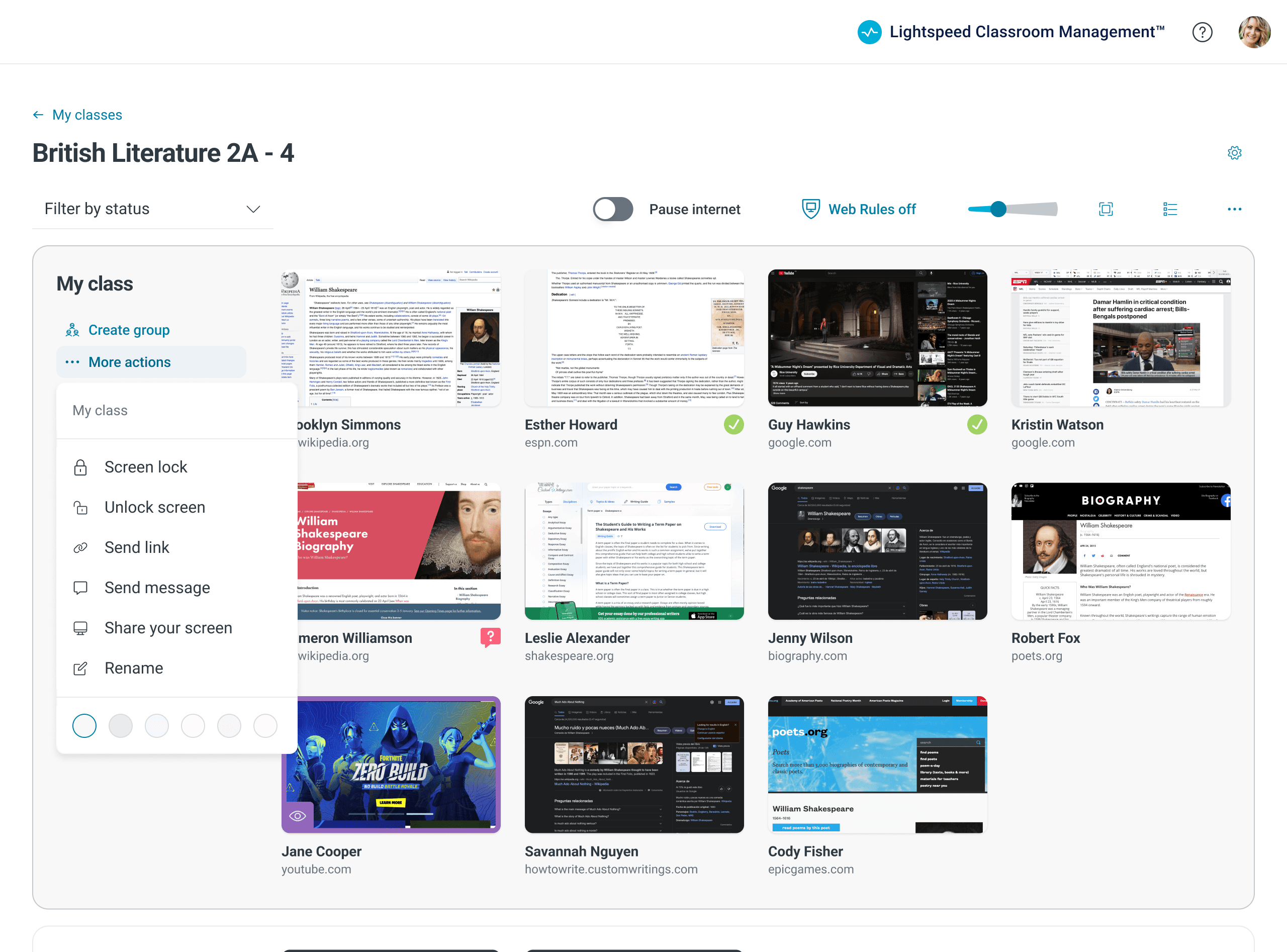
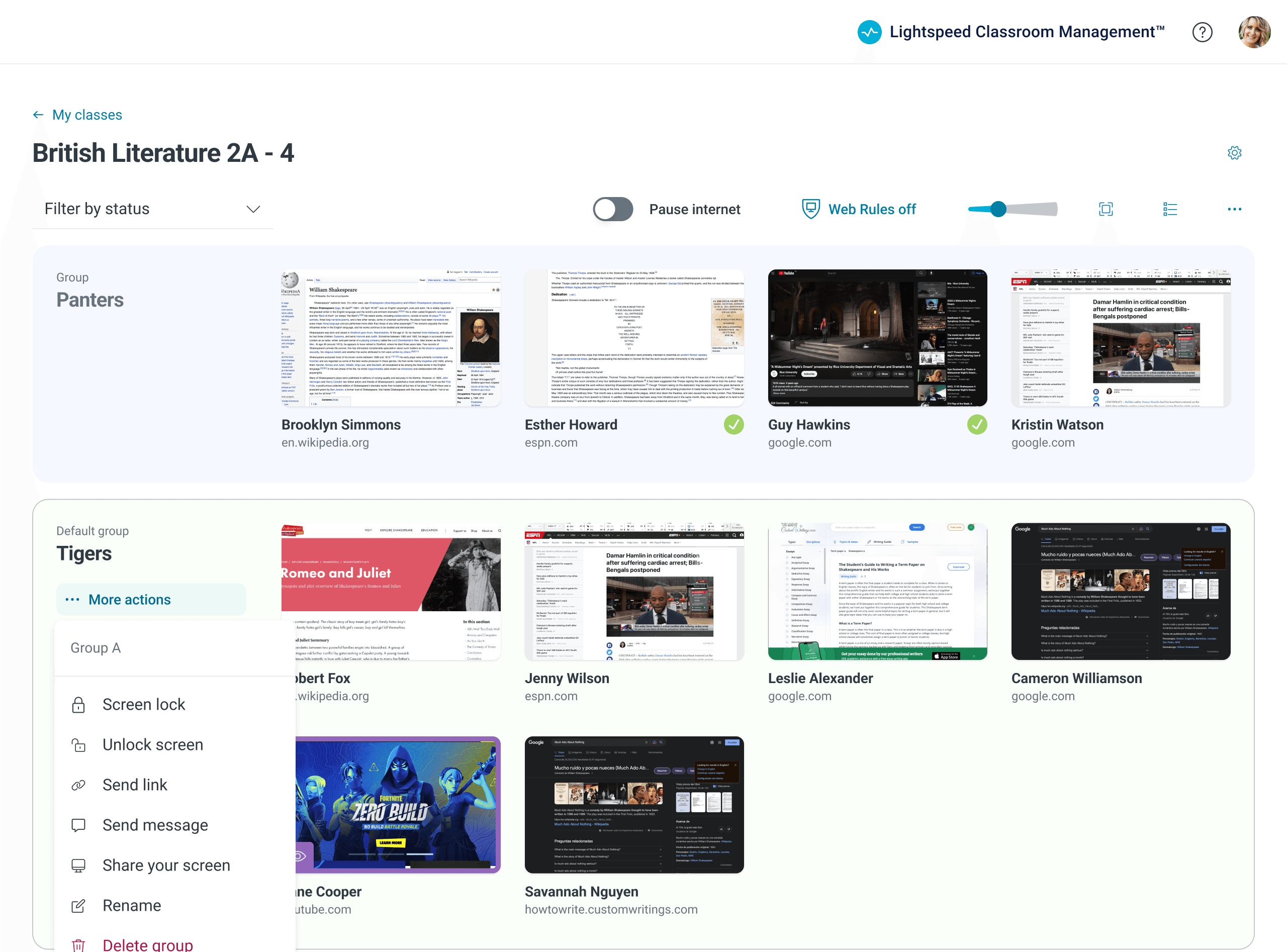
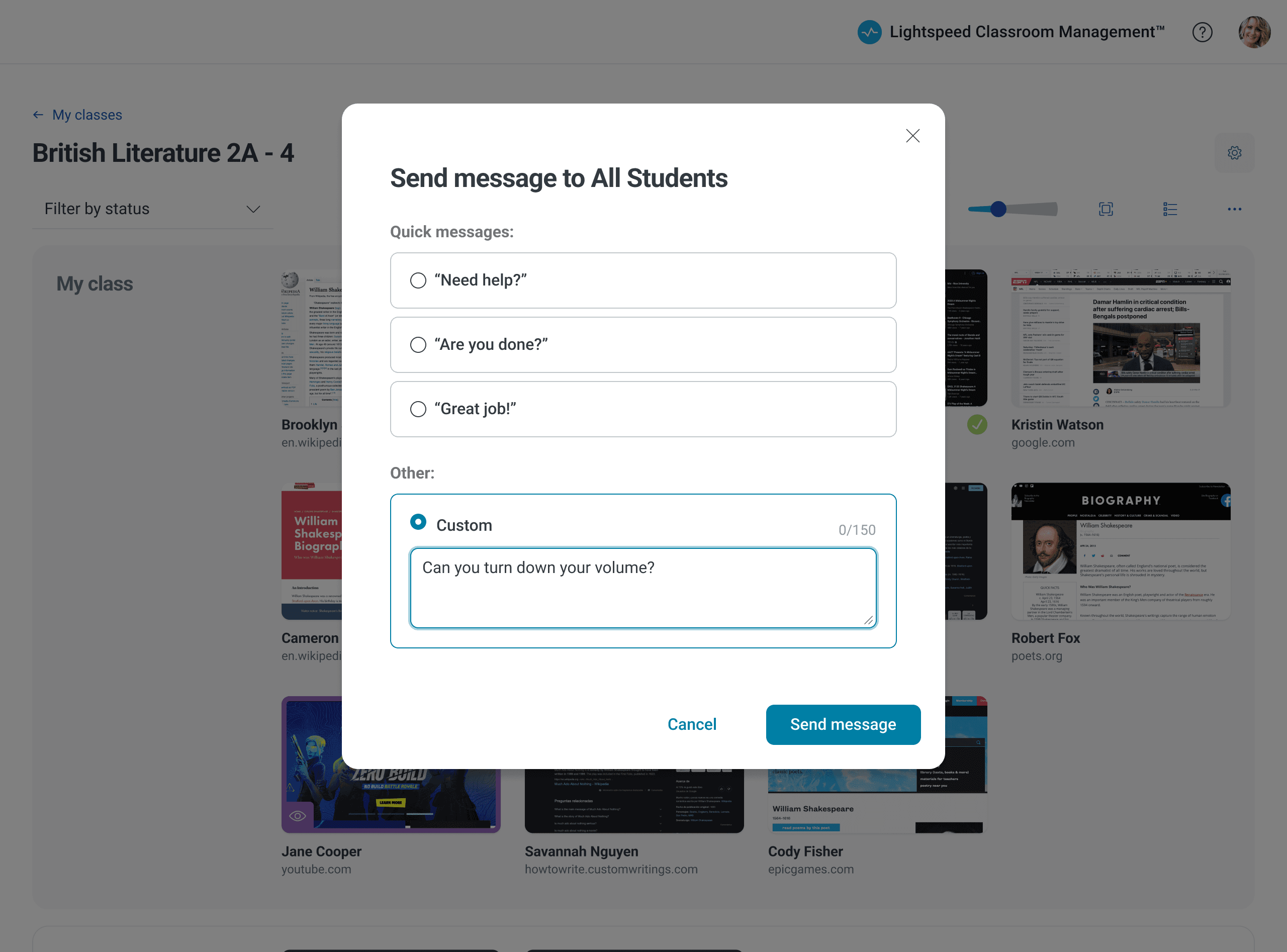
With the new app, I created a system of nested levels. At the base is a single student. Individual students can be placed in a group. And a collection of groups form the class. The teacher can perform similar actions at any of these three levels. For instance, a teacher can send a message to an individual student, a group of students, or to the whole class.
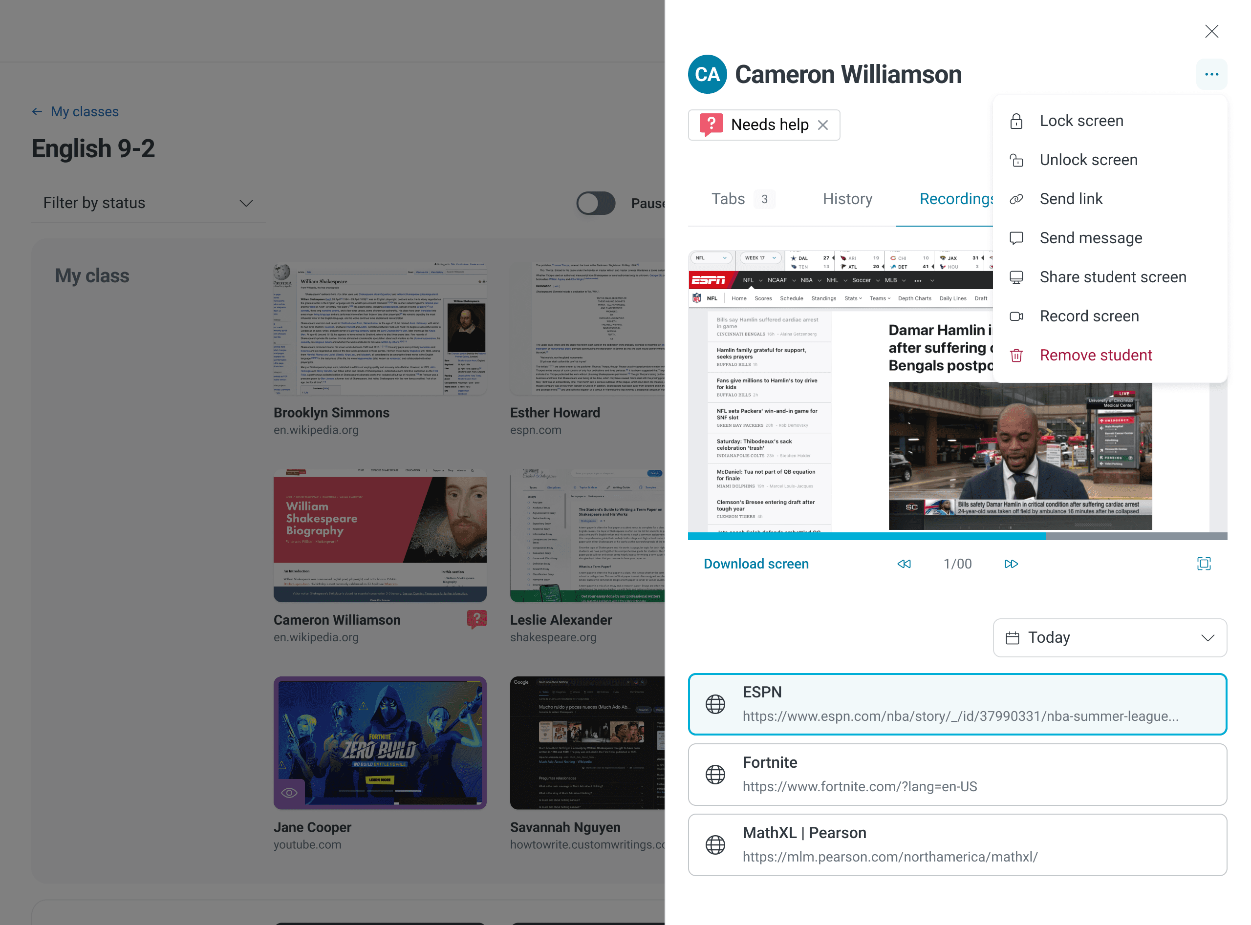
Accessing these actions is the same irregardless of the level. The teacher only needs to learn once that indvidual contextual menus hold actions at each level to master the app and discover new features.
Improving learnability and discoverability with a single pattern
In the new design, a teacher only needs to learn the pattern of accessing actions from within contextual menus to gain mastery of the app.
Future-proofing navigation
Previously, the app lacked a well-structured navigation system. While we had yet to define what additional modules we would add to the product, it was clear that we would soon need to offer add-on modules and functionalities extending beyond the singular use case of Classroom Management.
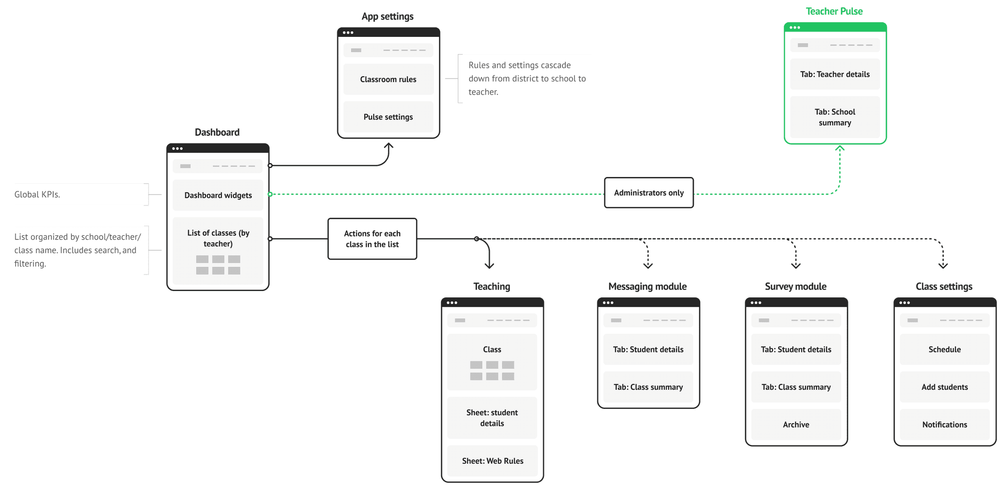
To accommodate this, I proposed a preliminary site map that included the following:
A dynamic dashboard
An index of classes with the ability to delve into individual class sessions
Add-on modules such as a polling system and chat
A dedicated section for settings
The structural improvements brought about an app that was not only highly usable and easy to learn but also had intuitively discoverable features. The redesign positioned Lightspeed Classroom Management for future growth, ensuring it could adapt to evolving educational needs and the competitive landscape.
Redesign: Eliminating Confusion
Redesigned workflow
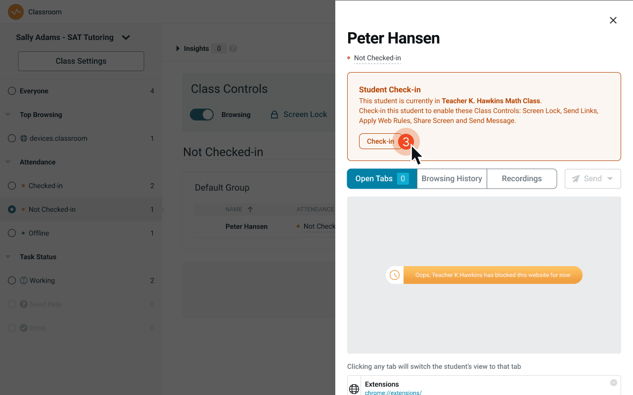
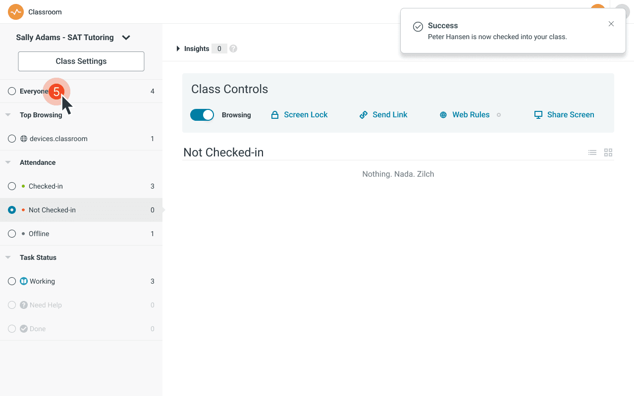
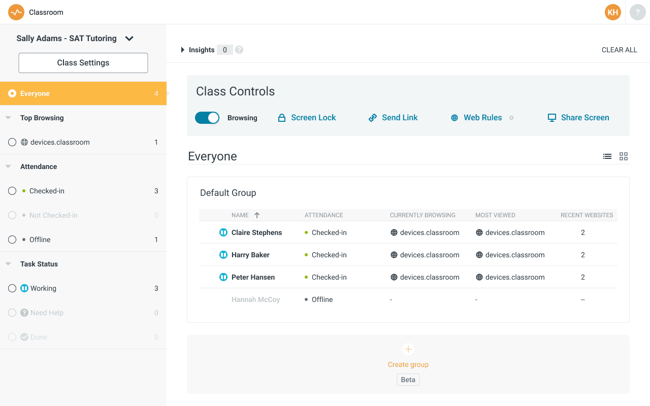
Checking students into class
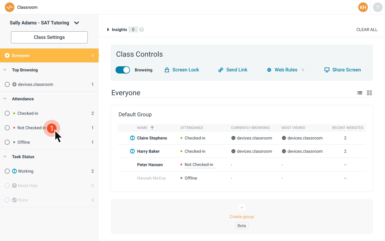
Original flow in prior app
At 5 clicks, teachers found the check-in feature tedious and confusing.
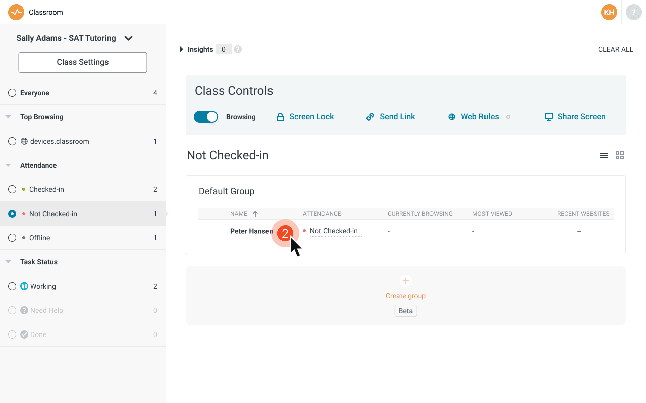
Redesigned flow in new app
I reduced the flow to a single click.
Redesigned workflow
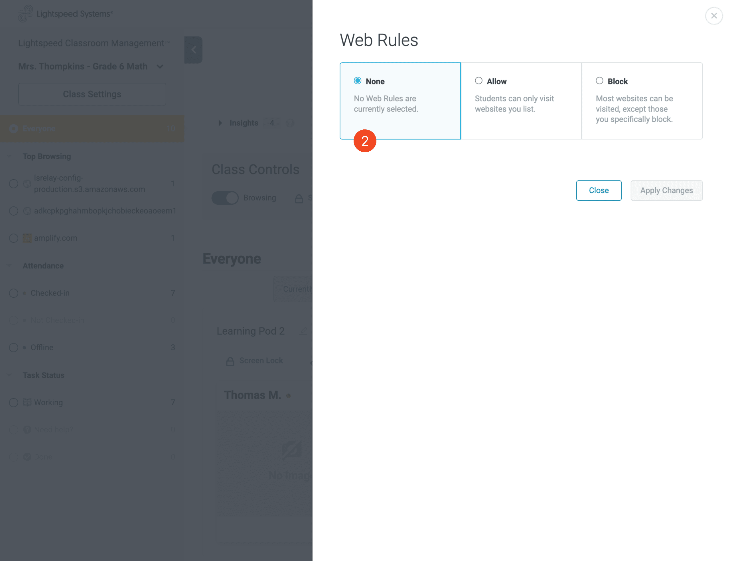
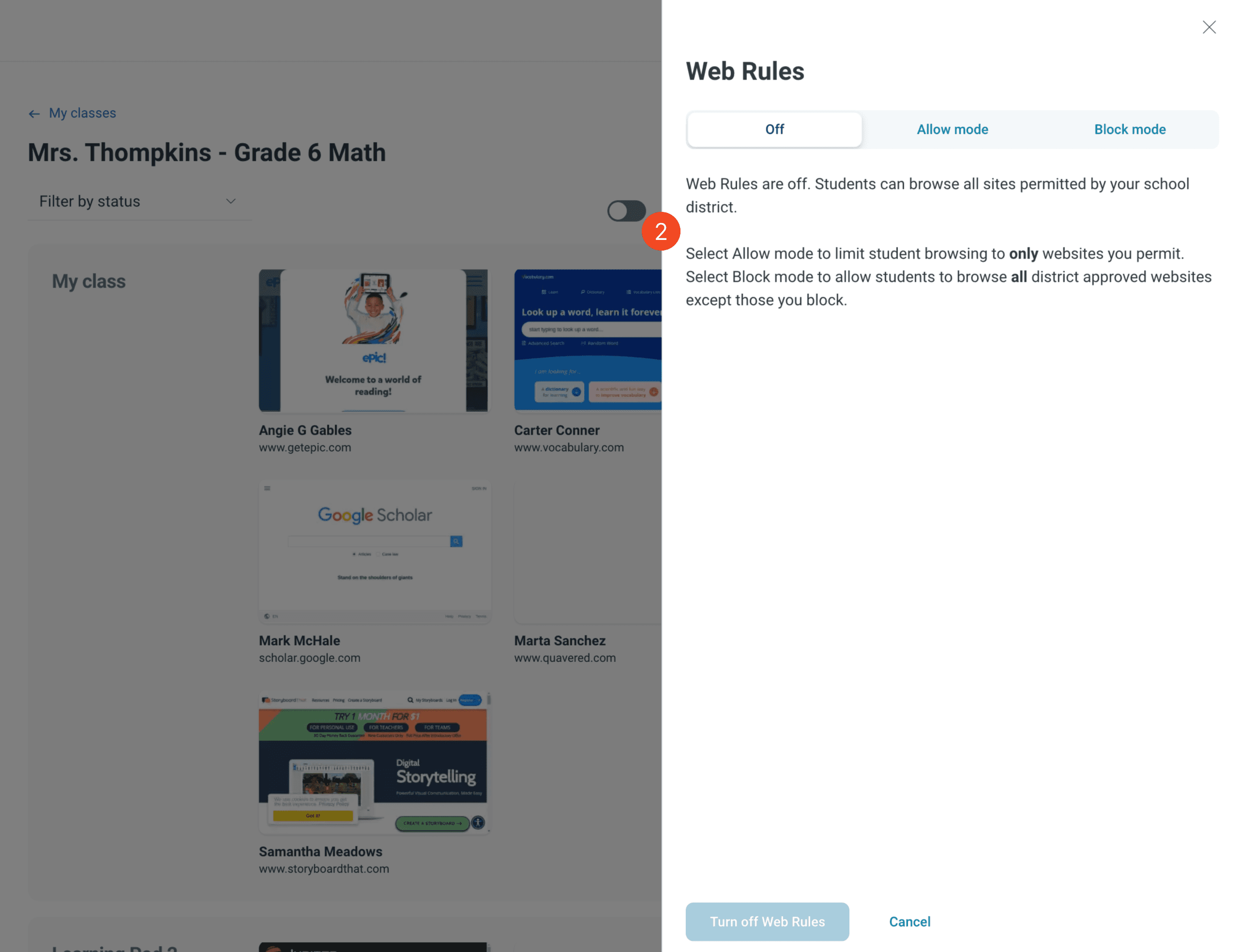
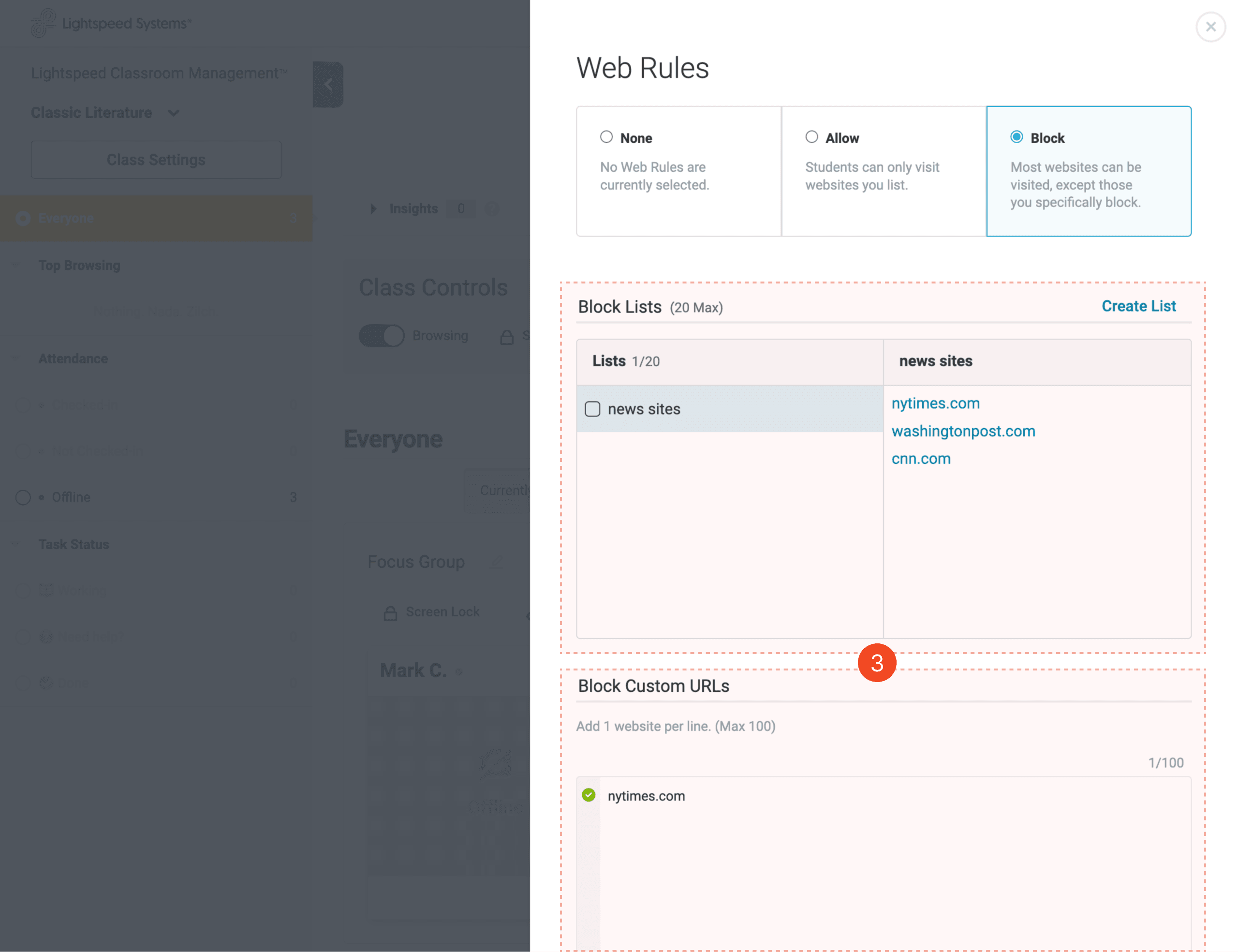
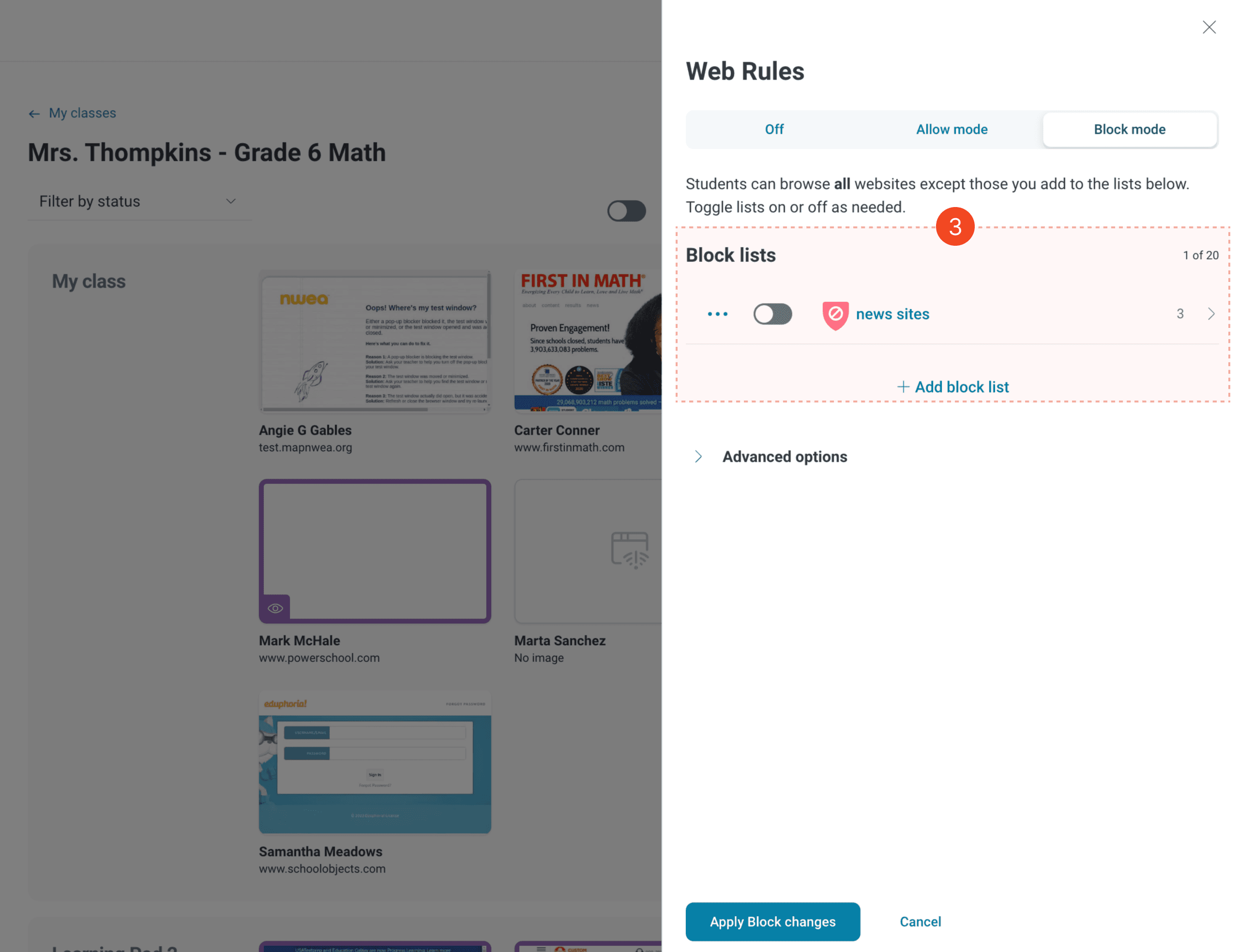
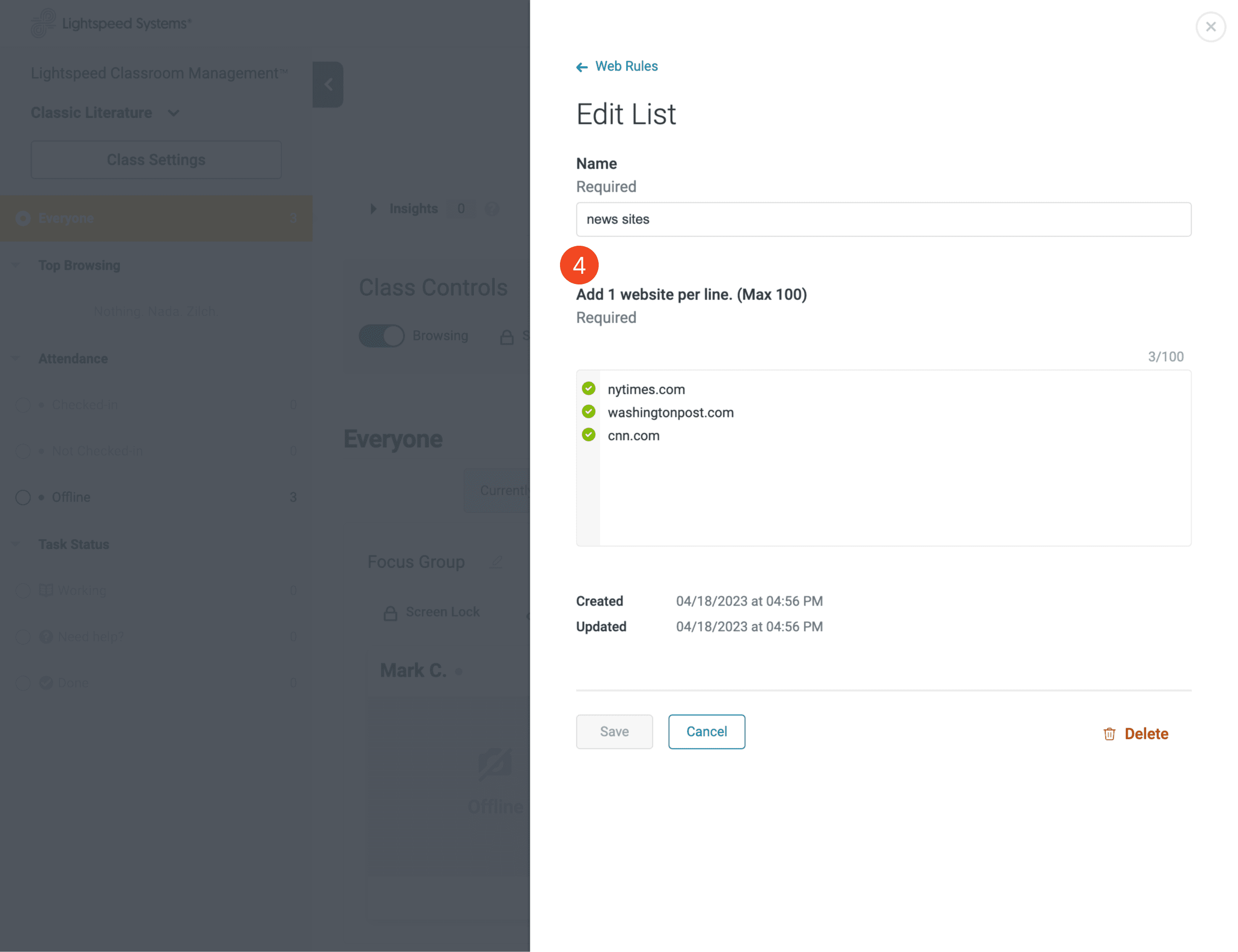
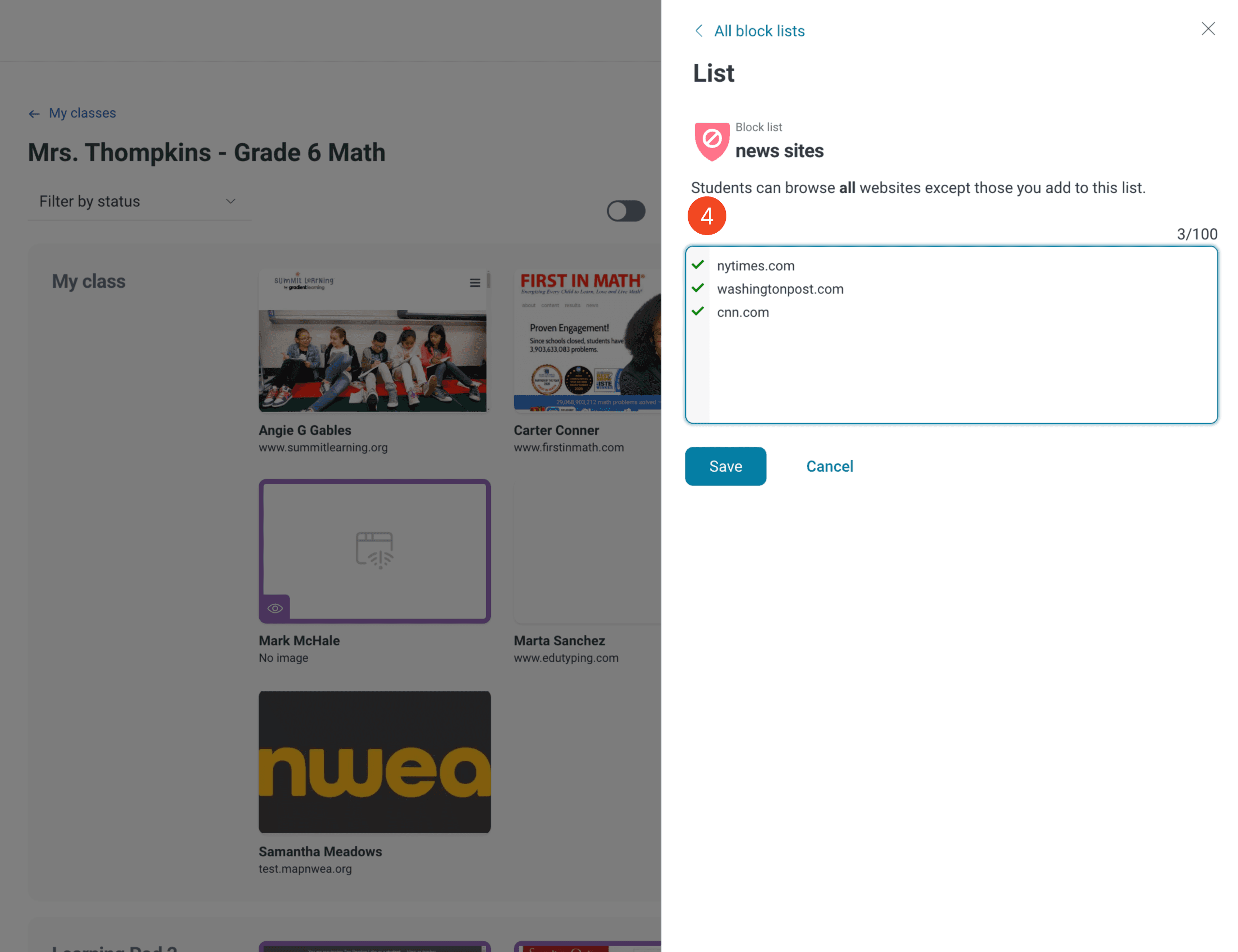
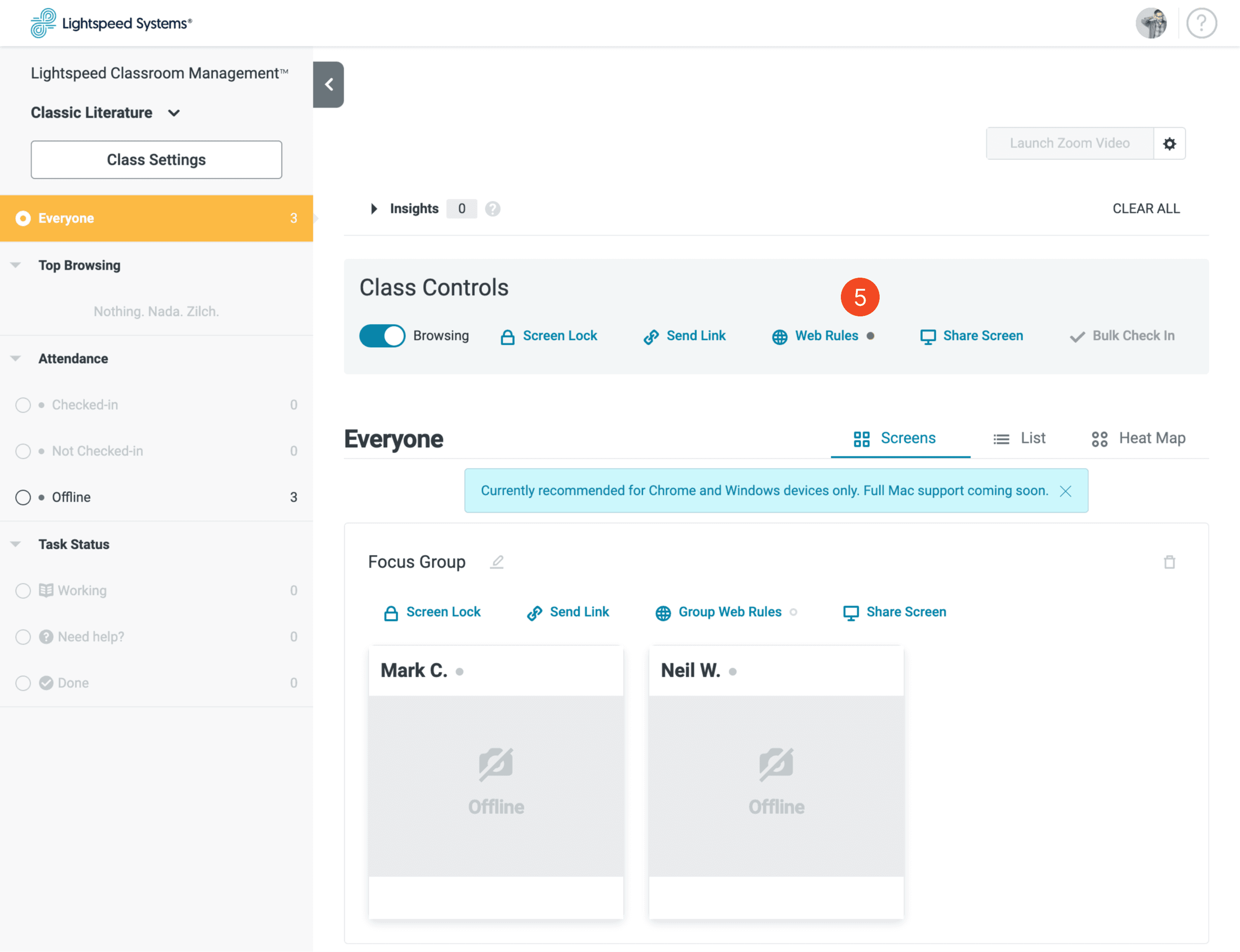
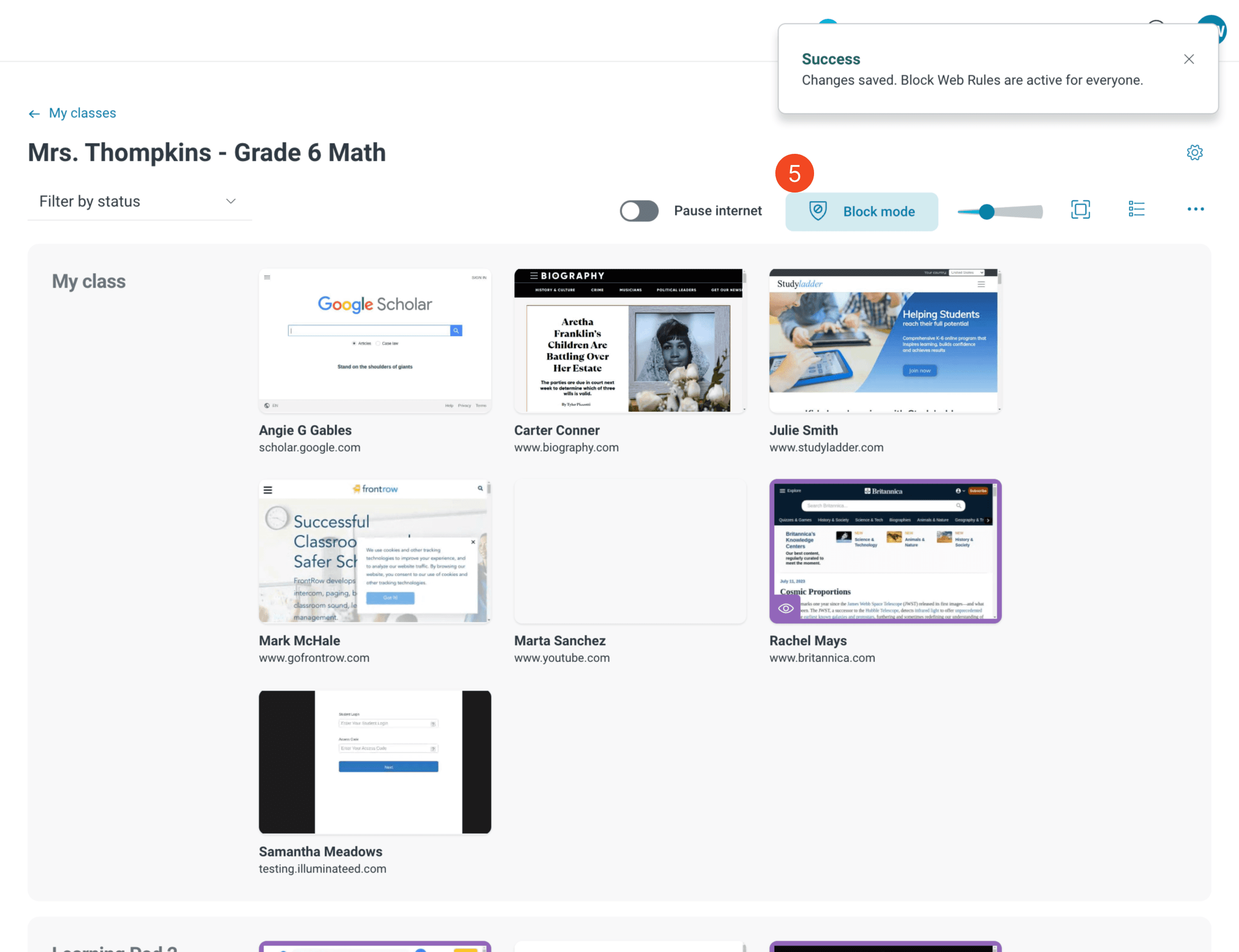
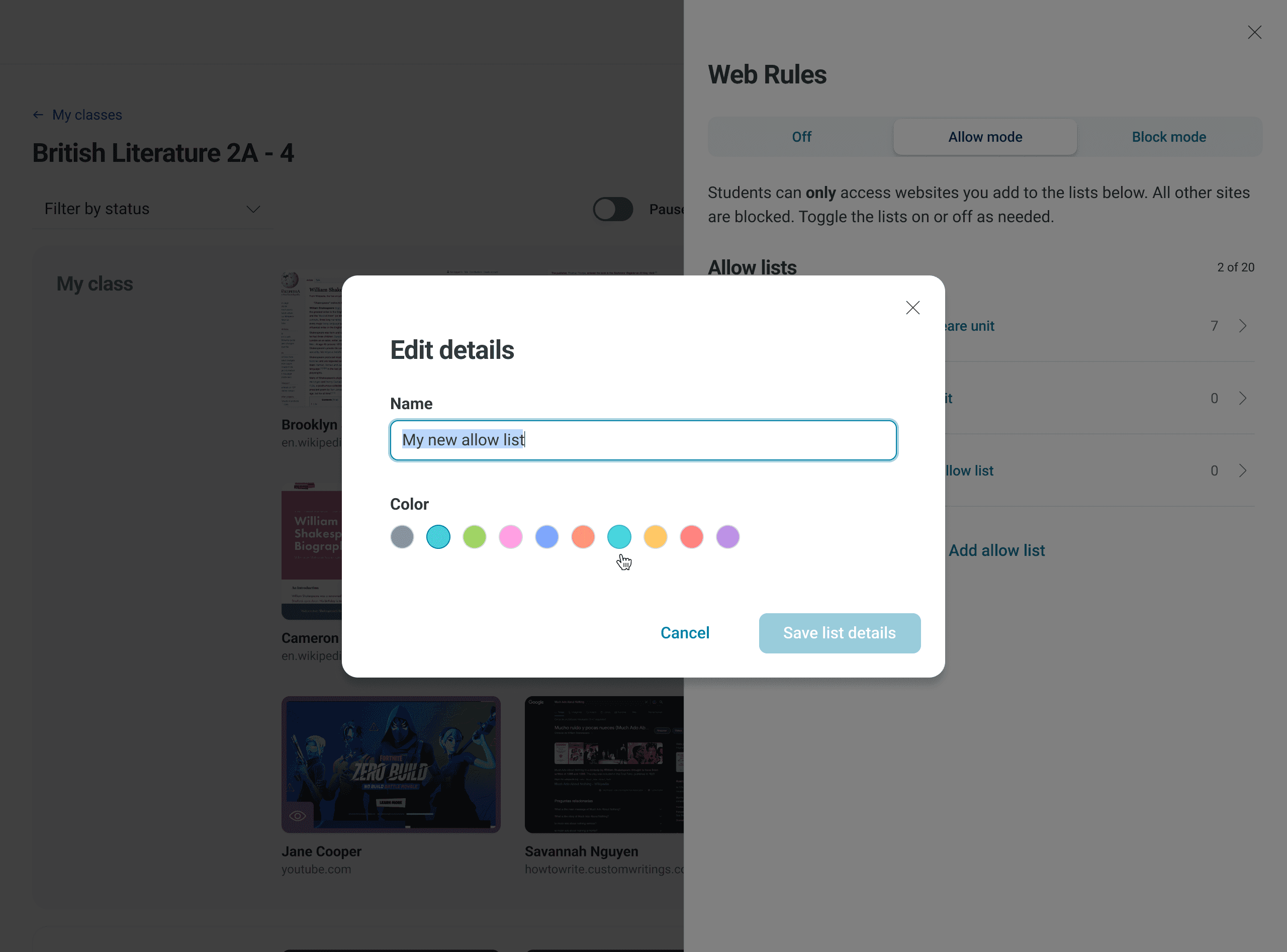
Allowing and blocking sites
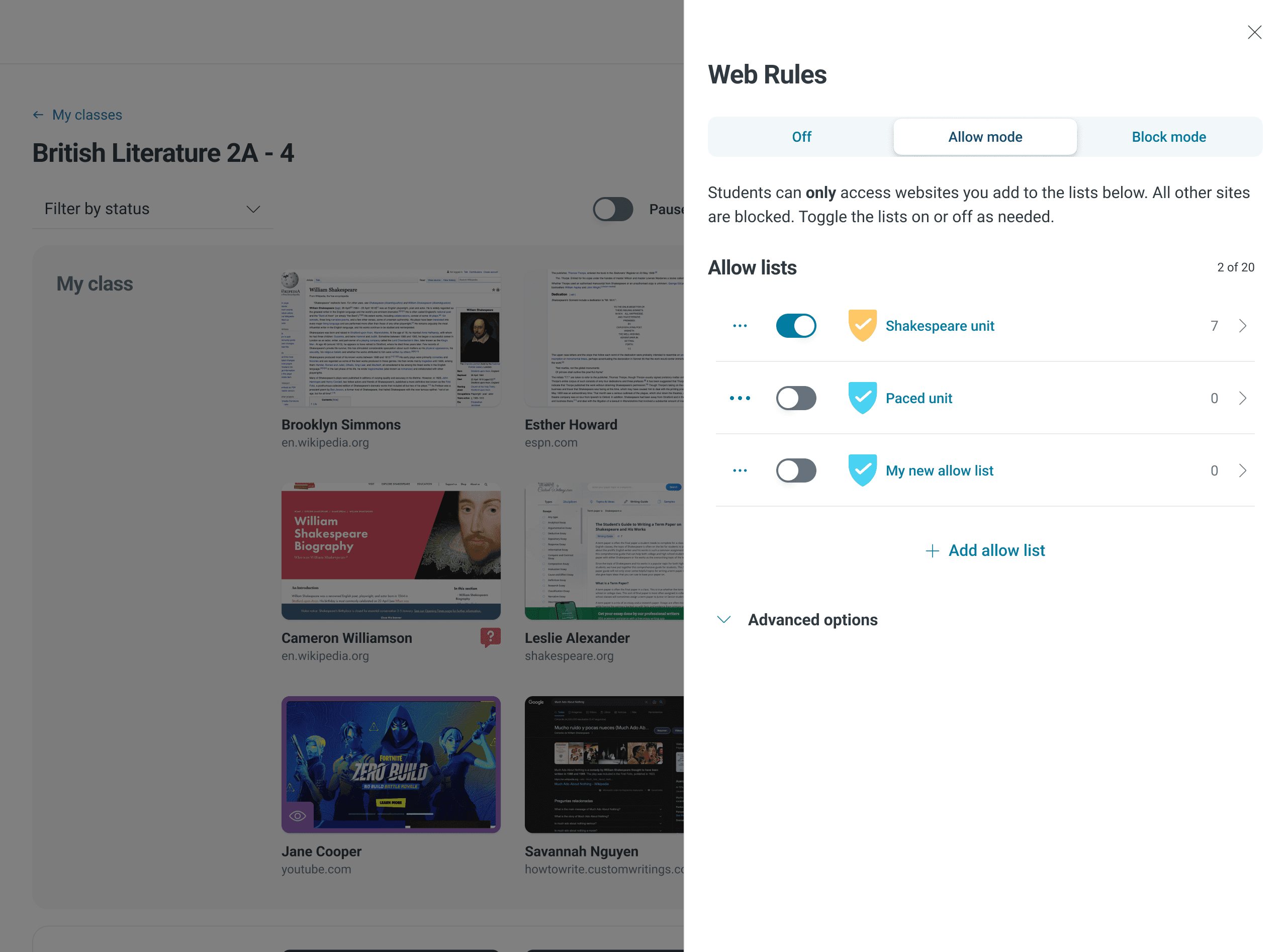
Permitting and restricting websites is controlled via the Web Rules functionality. Some teachers told us they found it complicated, so my updated design guides the user with stronger copy. Additionally, I streamlined the feature by removing the Custom URLs portion, which was Controlling website access is done through Web Rules. Instructors found it complicated, so I improved the design and provided clearer instructions. To simplify things, the superfluous Custom URLs section was removed.
Research and validation
Limiting the redesign scope to current functionality reduced the time spent on discovery, validation, and user testing. Since the app and its features had been in use for years, we had a wealth of customer feedback to guide us throughout the redesign.
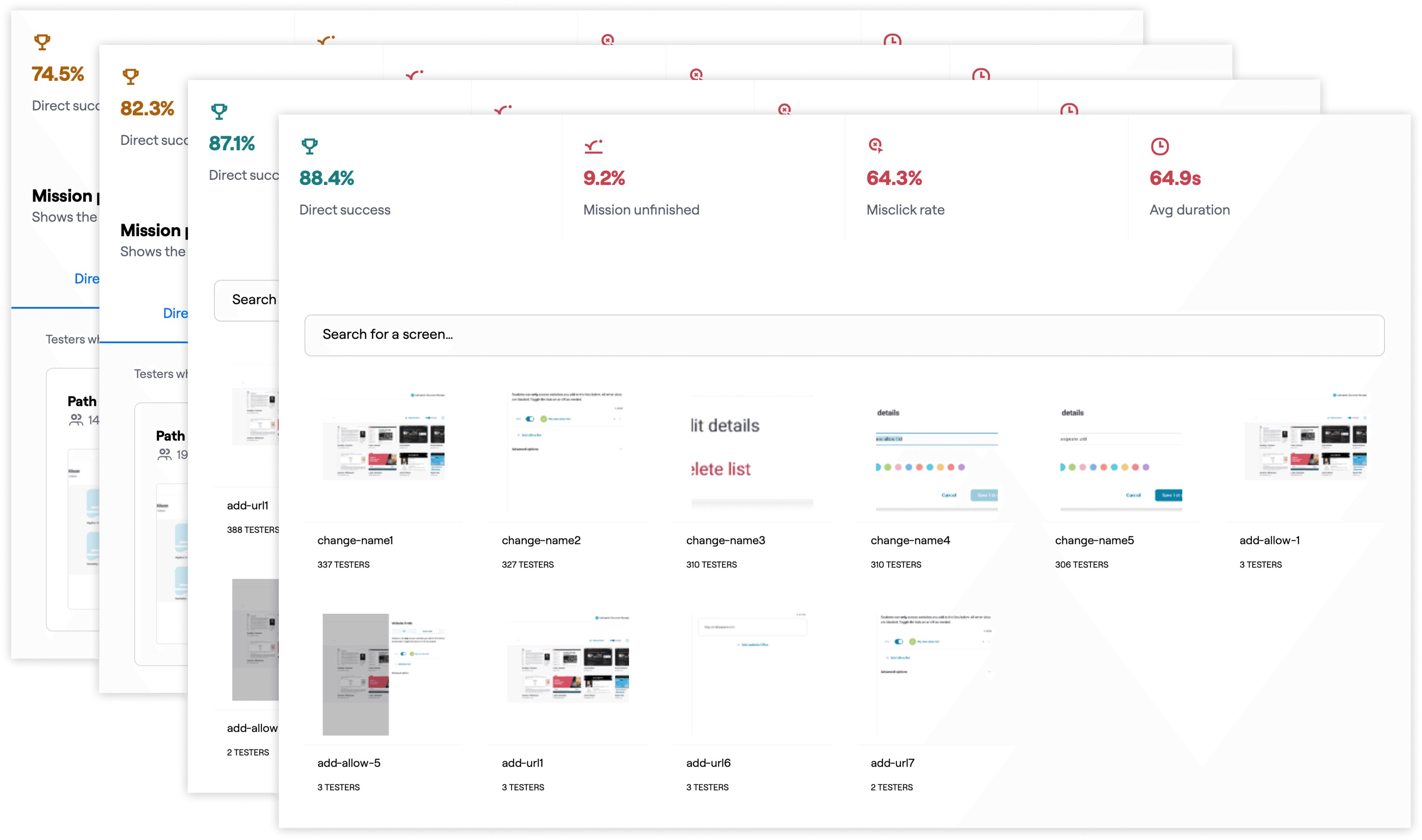
We conducted several teacher interviews and polls during the redesign to validate concepts. I progressively validated and iterated on designs from low-fidelity to mid-fidelity to high-fidelity. Furthermore, we conducted remote usability tests on new workflows and UI patterns.
Remote usability testing
Teachers love providing product feedback. I used Maze throughout the design process.
Outcomes and reflections
This fast-paced redesign was a challenge, and it did lead to team burnout. In the future, more time should be allocated for preparing handoff files. We also recognized the need to continually communicate the project's value, especially concerning long-term objectives, to counter any organizational fatigue that might set in.
Despite these challenges, the feedback from customers has been overwhelmingly positive. We received comments praising the intuitiveness and time-saving capabilities of the redesigned app.
The redesigned app's clean slate is already proving beneficial. We recently conducted a research study to identify new growth opportunities and quickly generated a year-long design strategy to build new capabilities to expand the product's reach. Using the updated UI and design system, we were able to quickly mock up a vision concept. Given the success and impact of this redesign, we plan to employ a similar approach with our Filter product.

